
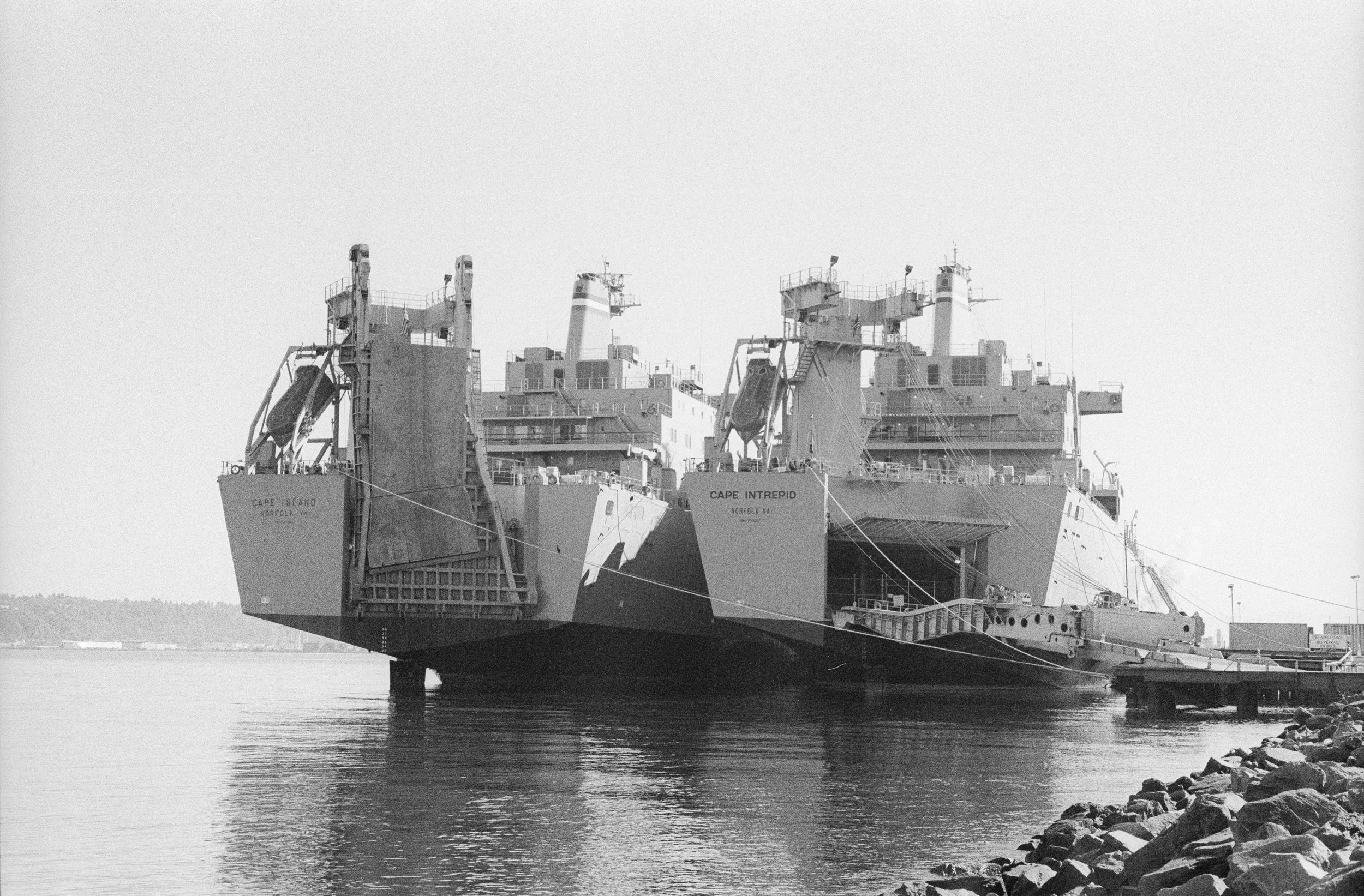
This blog post is meant to act as a supplement to the video linked above where I compared Ilford HP5 Plus and Kodak Tri-X 400. The main purpose of this post is to include images so that you’re able to better see the differences that I mentioned in the video. All images are as scanned and unedited. The first image shows a side by side comparison of the images that you can click on to see it enlarged. The second is a slideshow of the images. The first image will always be of HP5 and the second of Tri-X. Below each image will be the statement that I made in the video in case you’d like to have a reminder of what I said.
For this first image, let’s start with the grain. On my end the grain pattern between these two films are noticeably different. With Tri-X, the grain seems to be closer together, giving it the perception that it is finer. With HP5, I can see a lot more space in between the various textures of the grain. This makes it more noticeable and prevalent in my opinion.
In terms of sharpness, I’ll cover this later with pictures that I think show the differences better.
Contrast. I think between these two images, although the differences are minor, it is noticeable. Tri-X is a more contrasty film. Pretty anywhere that’s in shadow, in this image, the blacks are going to be darker. Looking that the face of the artist with HP5, it almost looks like there’s one shade of grey. While on Tri-x, there are clearly defined shades and tones. You can argue that this is because the artist moved and the face is lit differently but I don’t think anywhere near what these images show. Remember, he’s wearing a hat and realistically, under that bill there should be noticeable shadows. In this situation, I think Tri-X is more true to life.
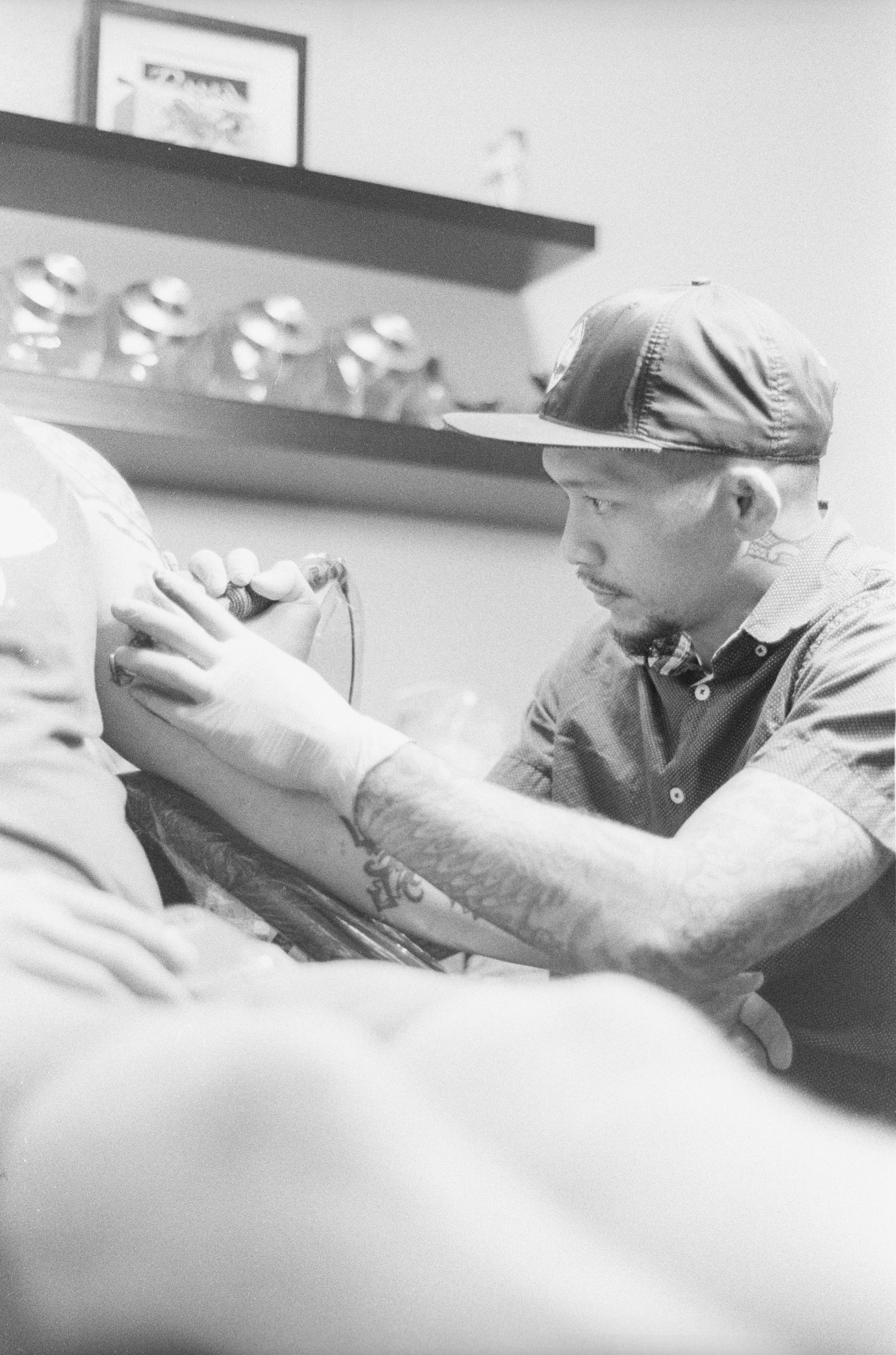
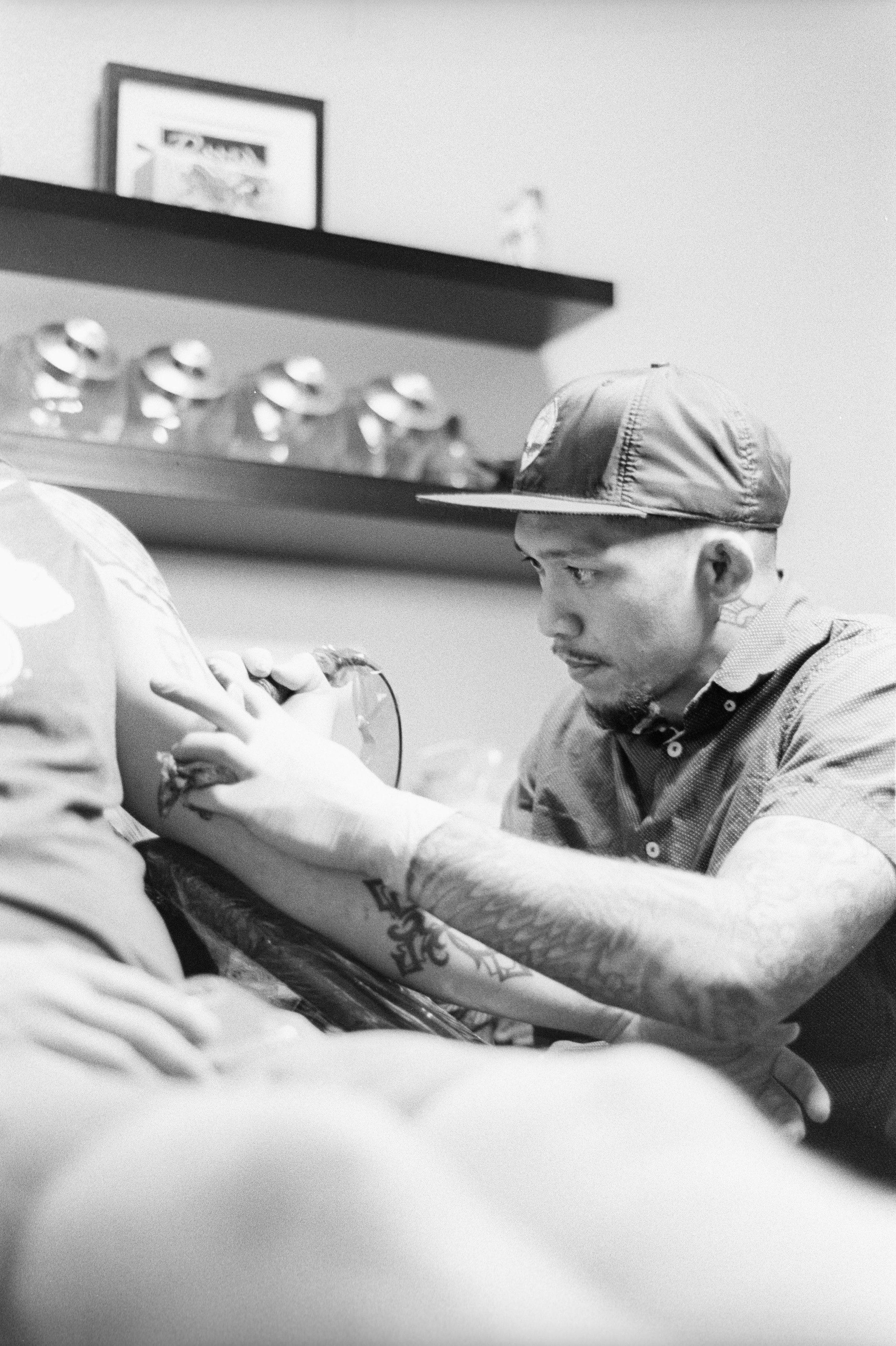
The same things can be said about this image. Pay attention to the fresh black ink on the client’s arm and the chair that he’s sitting on. The grain is much more noticeable in HP5 while Tri-X is much smoother. Tri-X is again also more contrasty. The dark parts of the chair are black. There’s no detail there with Tri-X while the chair is more of a grey with HP5.
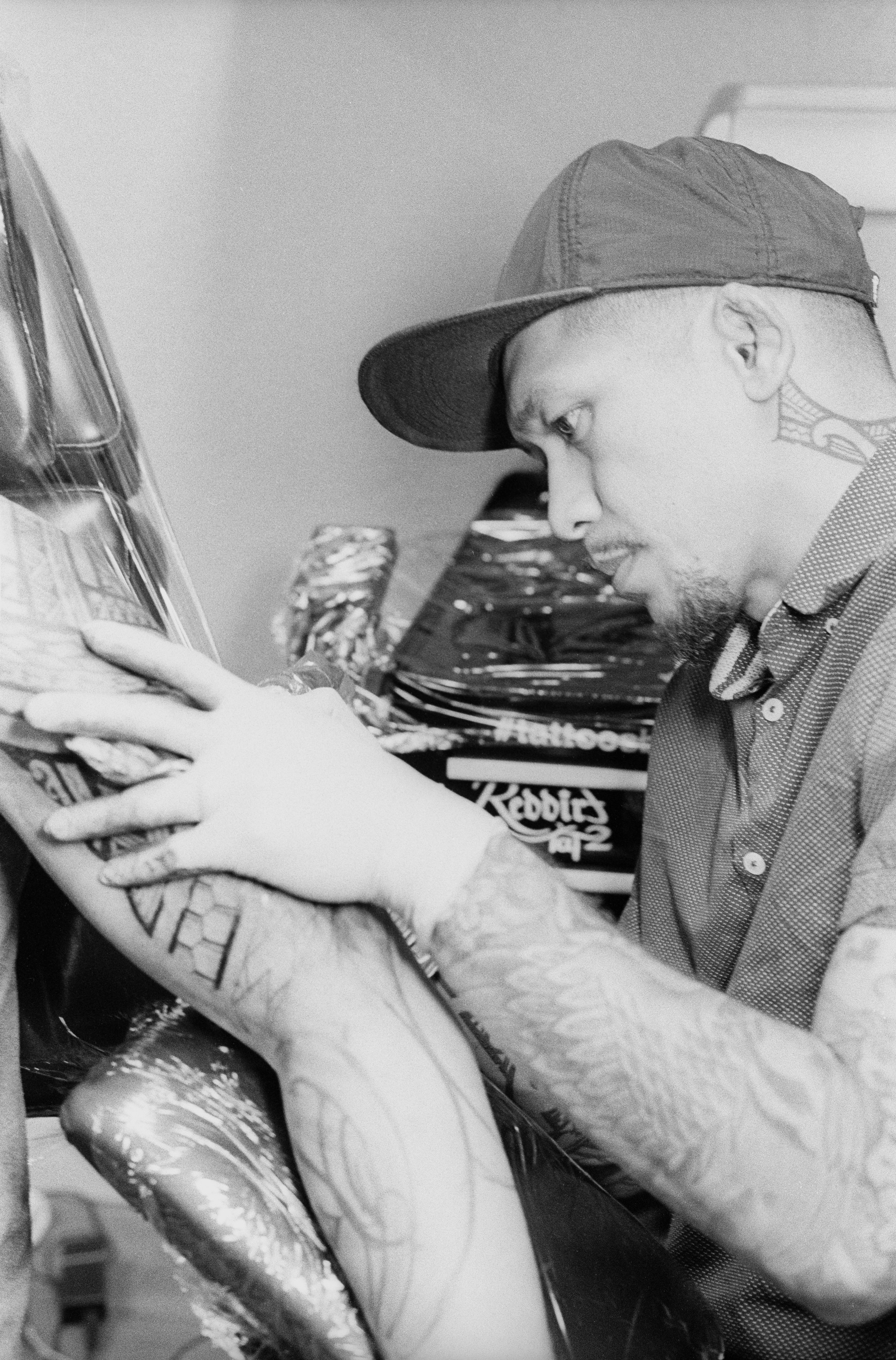
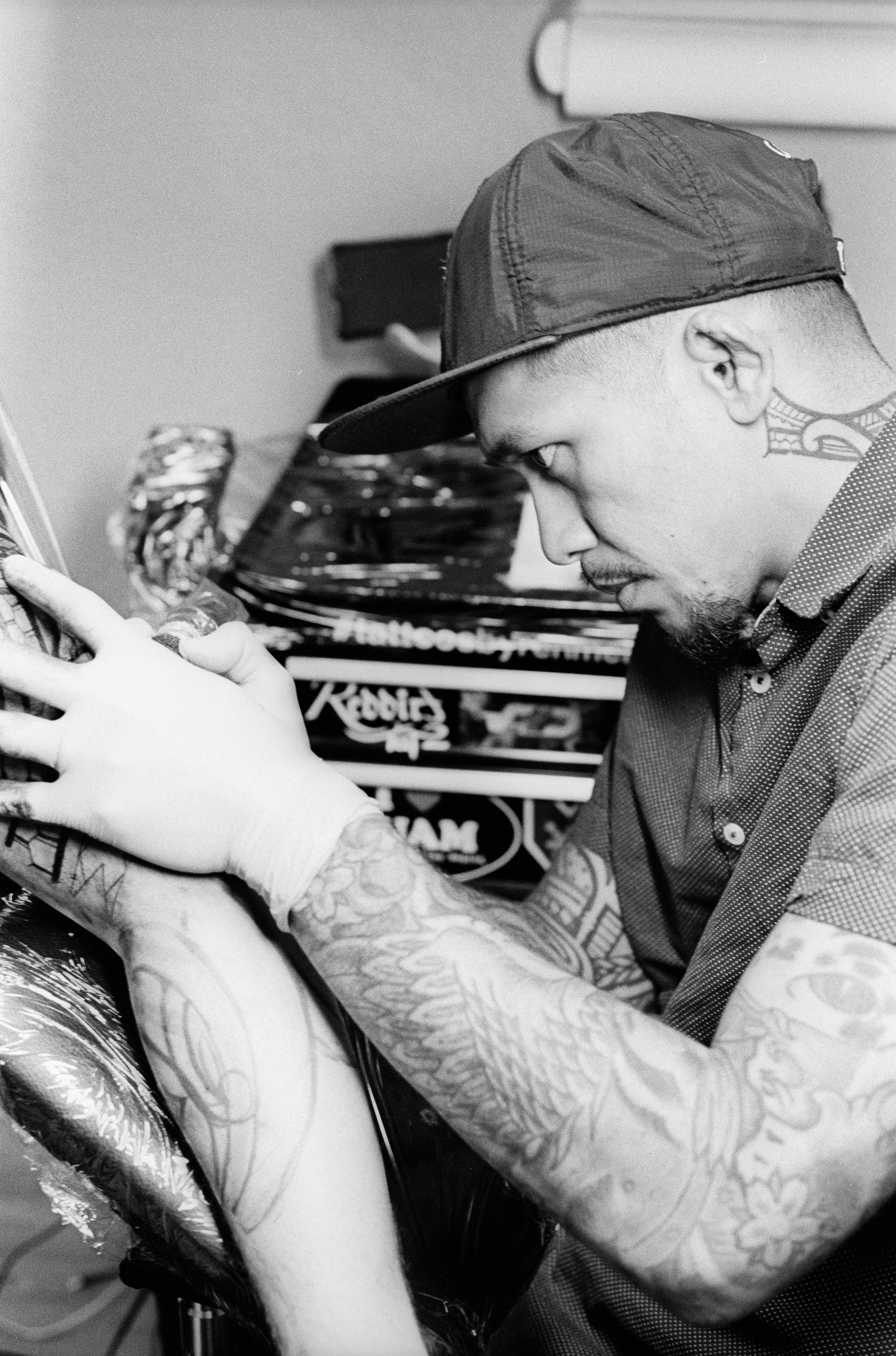
In this third example, look at the shadows around the eyes of the artist. HP5 has lighter shades of grey that largely blend in with each other. Tri-X on the other hand, very apparent differences in tones.
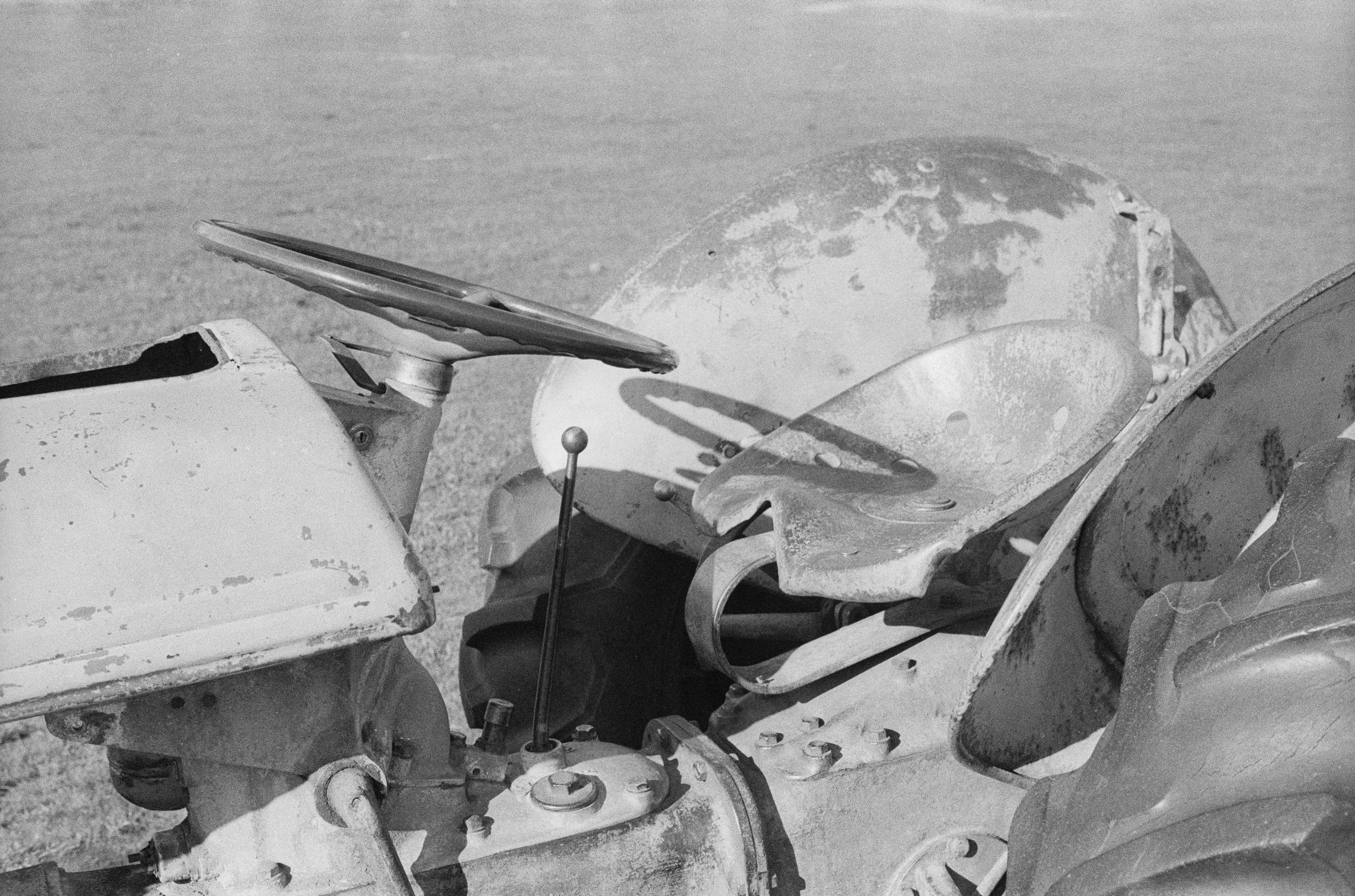
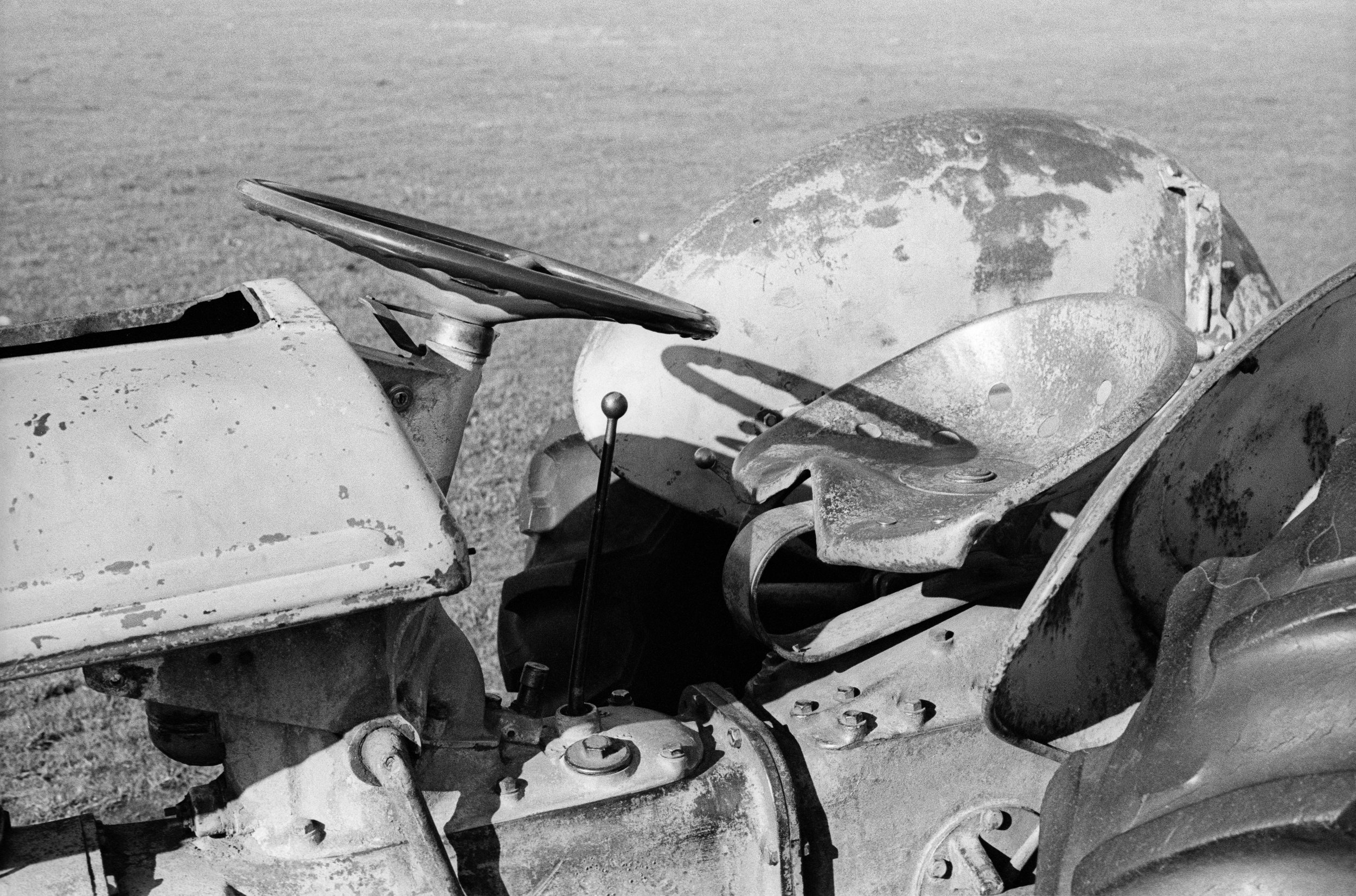
This first image is of a tractor. I think everything that I previously mentioned about grain and and contrast are true here. Grain is less noticeable with Tri-X and it is also contrastier. I wanted to show this image because I’ve noticed that on a general, HP5 seems to produce an overall brighter image than Tri-X and this could be for various reasons. Hp5 could simple be a higher speed film than box rating. The extra brightness could also be because of the lack of contrast. Because the image doesn’t have as many dark tones, I could just be perceiving the HP5 image to be brighter. There are a lot of reasoning to this but in general, I personally perceive Hp5 to produce a brighter image.
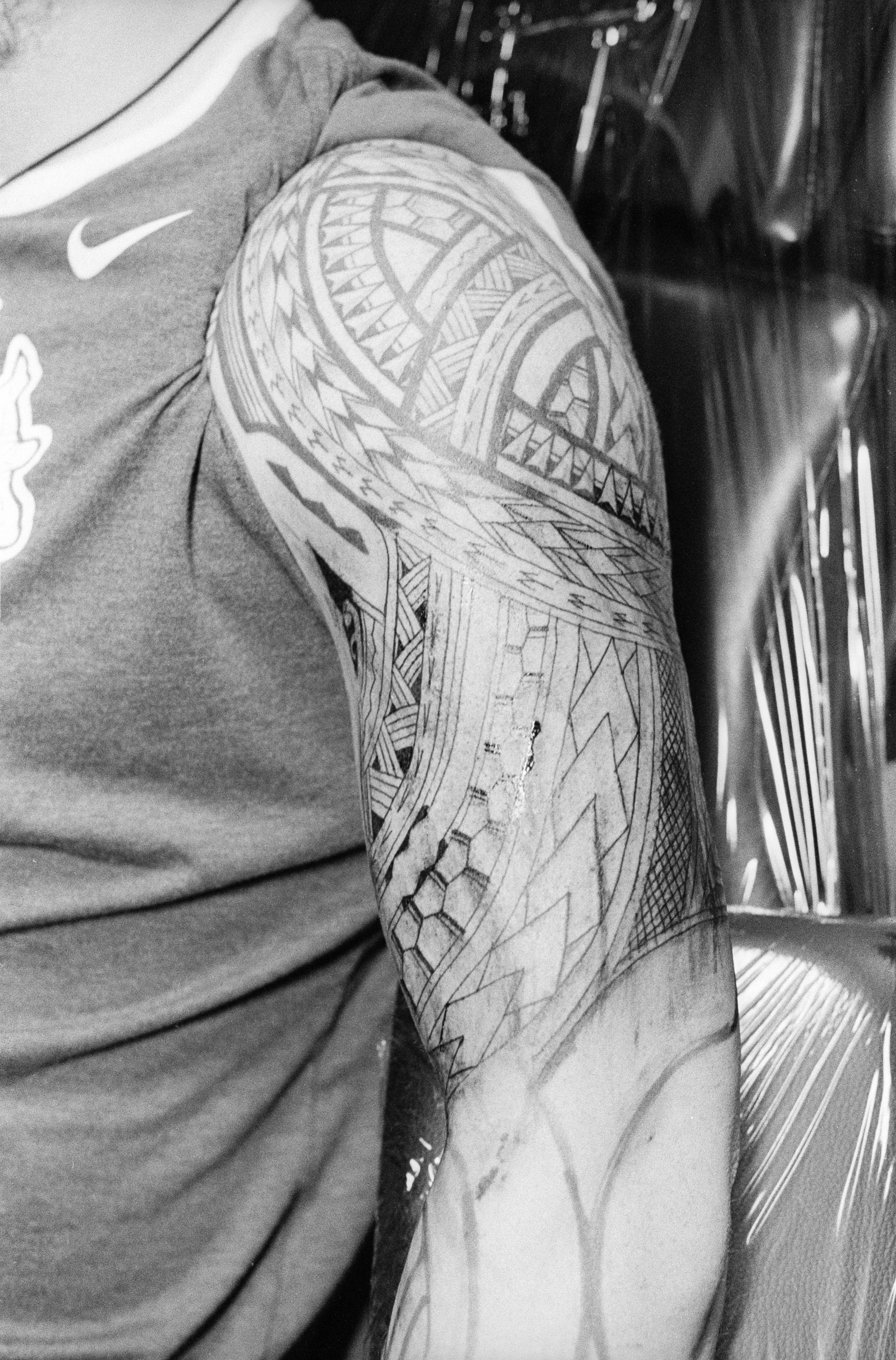
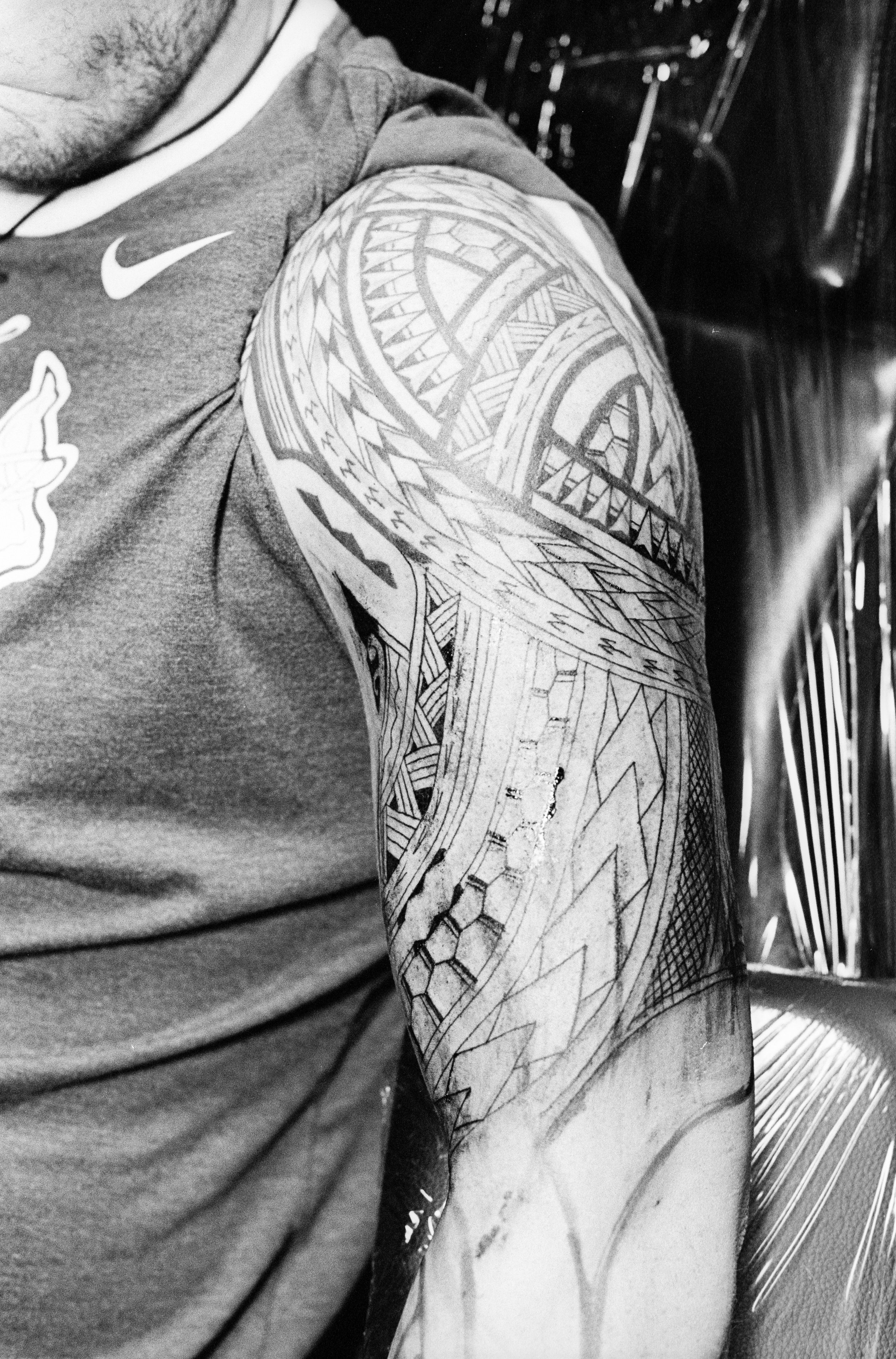
Here’s an image taken at f/1.8. I think if you’re examining grain, a good way to do so is by looking at the bokeh or the out of focus areas of an image. The grain really stands out in both of these images to me. I would still say that Tri-X provides a smoother grain. I would describe HP5’s grain as being clumpier. It’s just spaced out in a way that’s makes it looks like there’s more grain in a particular area. It’s difficult to describe but overall, I believe that Tri-X provides finer, smoother grain.
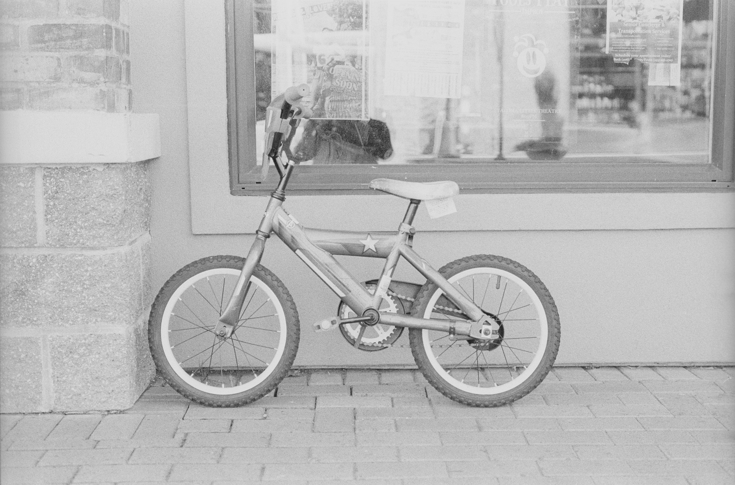
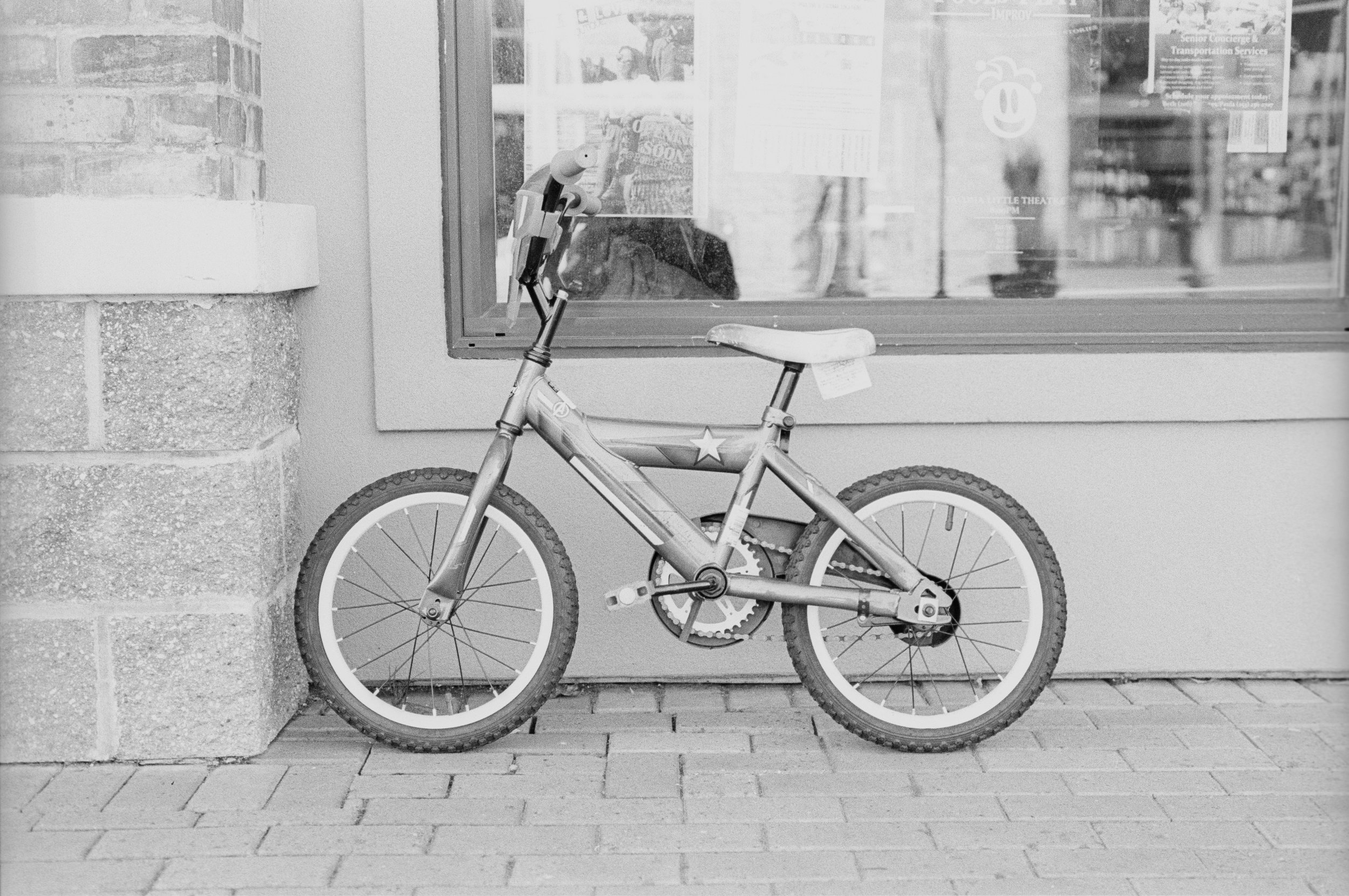
These last few images were taken on a third day at my local waterfront. This first one is a straight forward side profile of a bike. Looking at this image, I notice this difference in contrast right away. Again, Tri-X is much more contrasty. I chose this image because the contrast of Tri-X really makes the bike pop out from the background. There is a clear separation between the bike and the background and that’s because of the dark tones with Tri-X. The HP5 image again, provides more shades of grey than any real blacks. This contrast also really adds to the perception of sharpness. Because the bike stands out so much in the Tri-X, it just seems like it sharper. Your attention is immediately drawn to the bike. I can’t really say this for the HP5 image where the bike just kind of blends in with the wall.
This next image shows the same thing. The extra contrast of Tri-X really helps to provide separation for the boat from the other aspects of the scene like the sky and water. The contrast helps to show depth in the boat. It helps to show that there are surfaces at different distances from the viewer. With the HP5 image, it almost looks like the different surfaces of the boat are on a flat plane. There’s little depth or dimension in the boat.
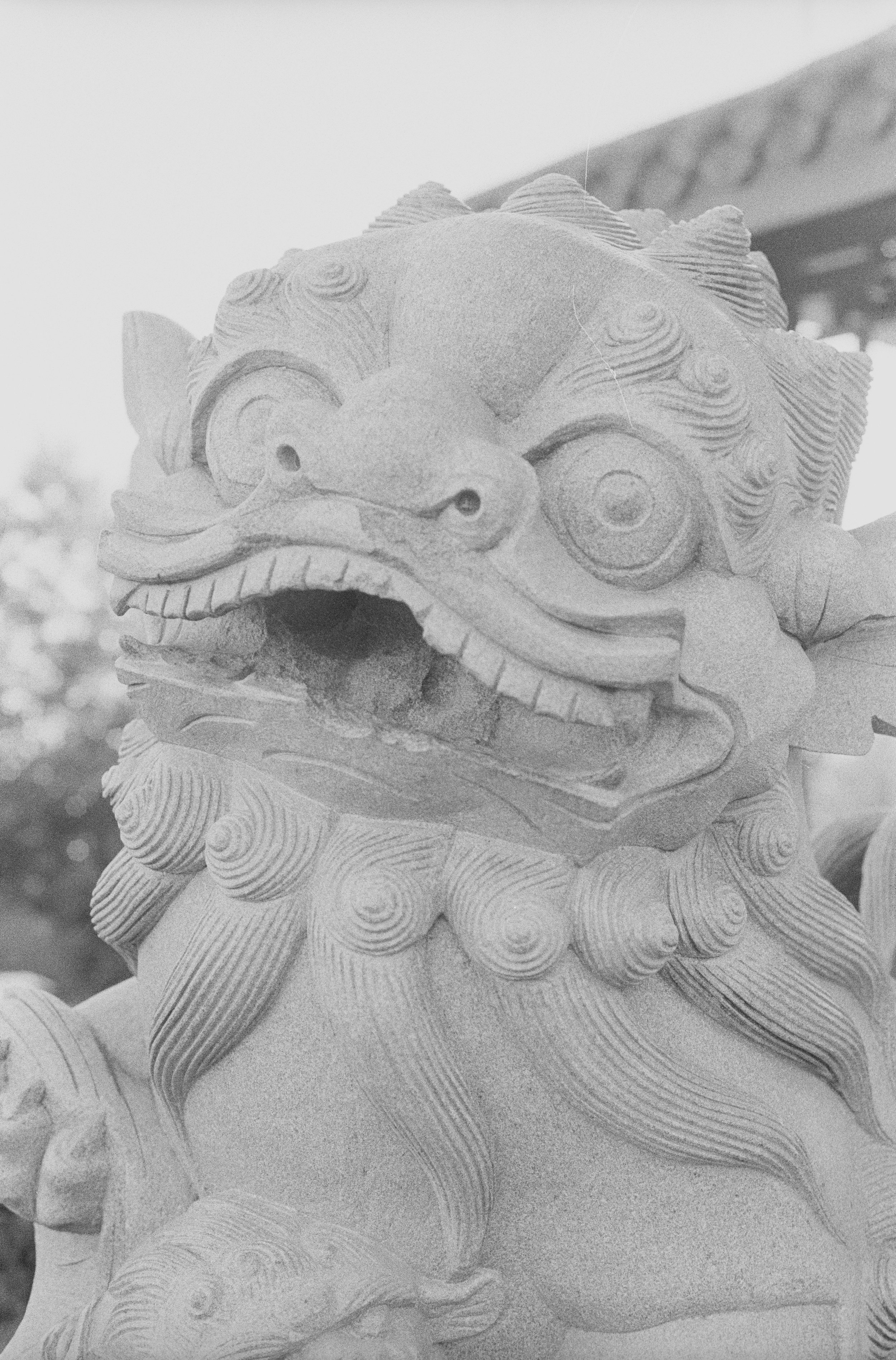
Here is a portrait style photo of a Chinese lion statue. Focus was set on the right eye and to me there is such a clear distinction between the two images in terms of sharpness. Tri-X looks so much sharper to me than HP5. The lines of the eye is clearly defined compared to HP5. To me, this image shows that Tri-X is a sharper film than HP5 but again, I think the contrast of Tri-X helps with this. The extra contrast helps with the separation between surfaces and provides depth which promotes sharpness.
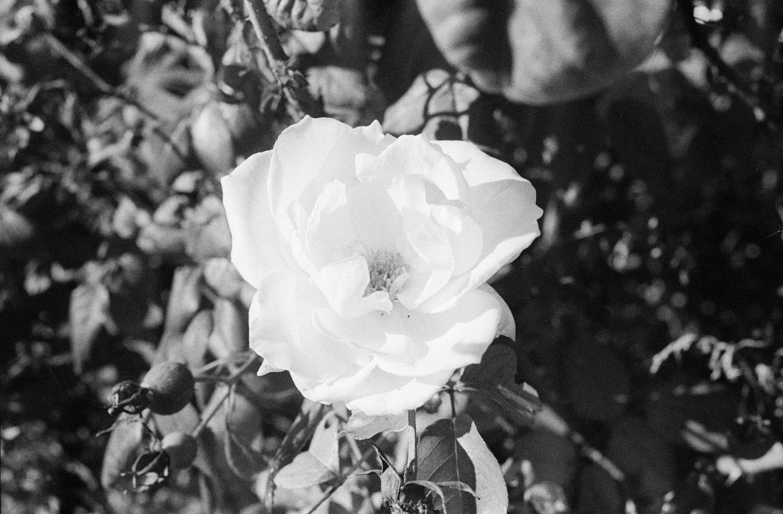
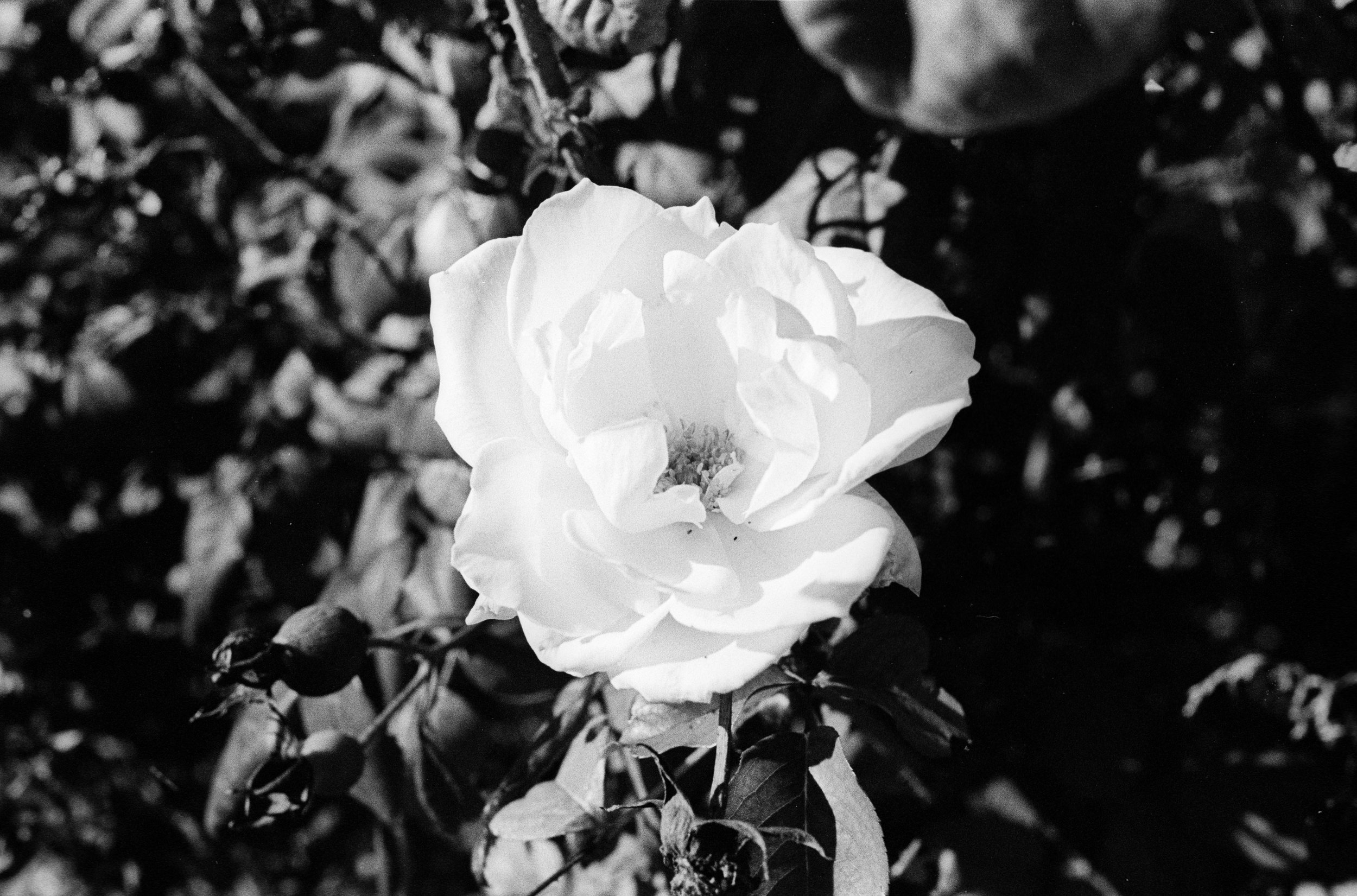
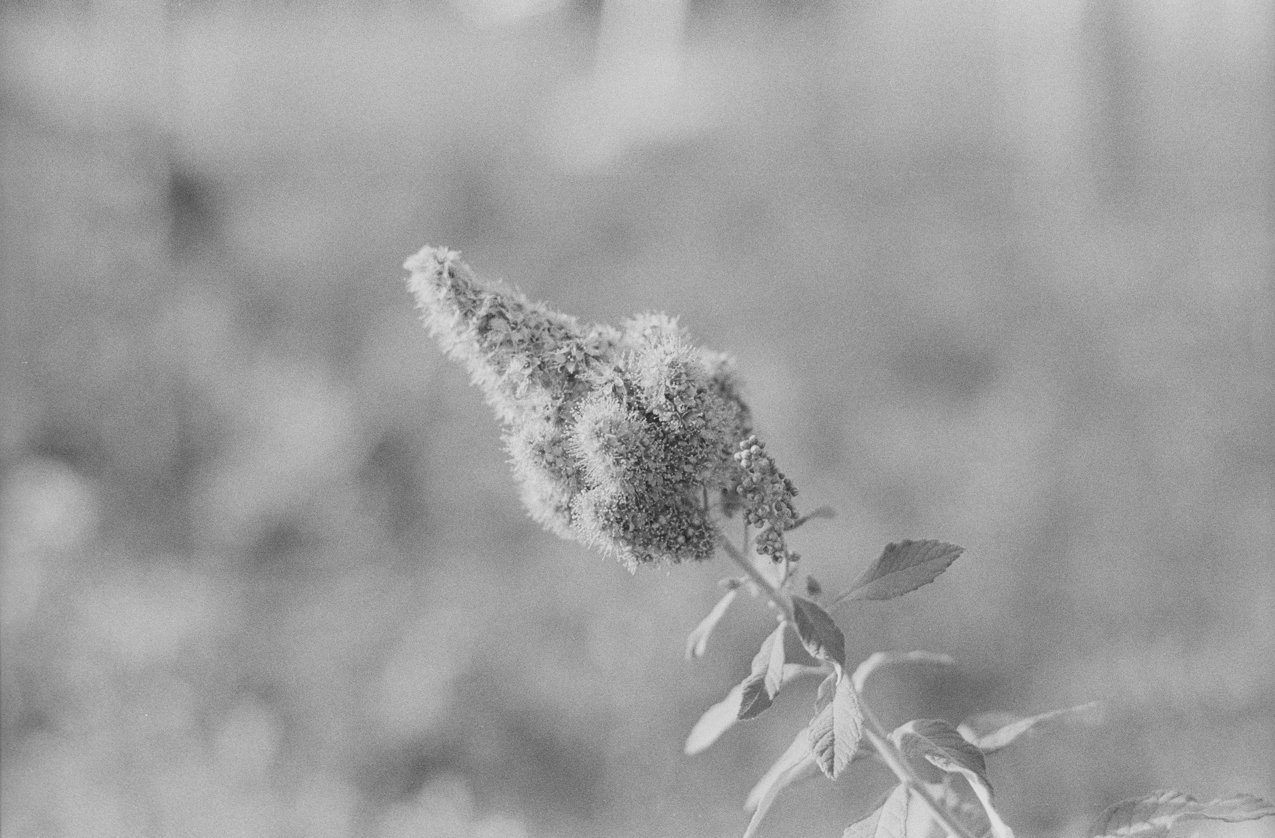
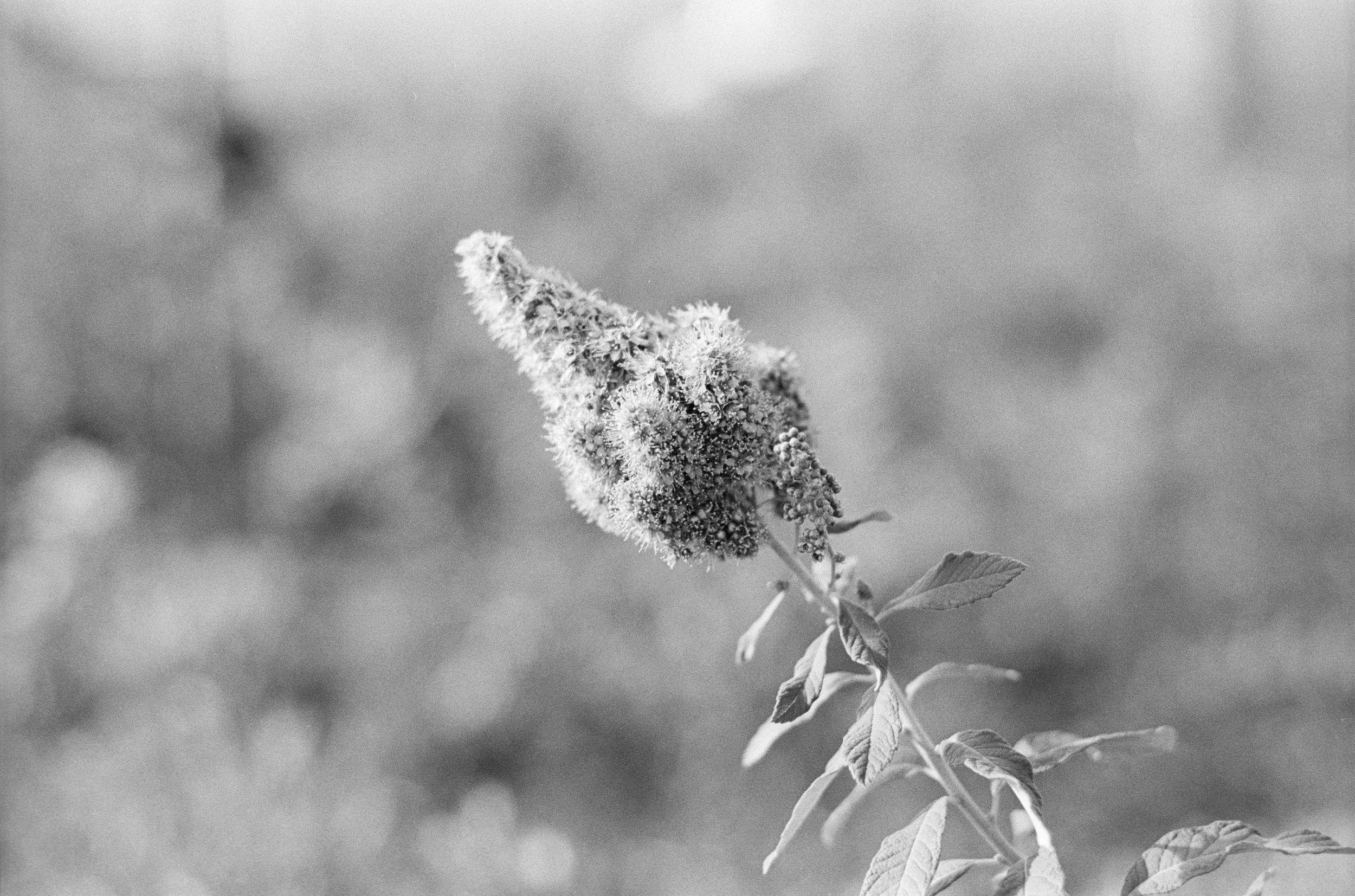
Moving on to the last photo for this comparison. I chose this photo because it really exhibits the stark difference in contrast that you can get with these two films. With this, there’s a white subject on a darker background. In reality, the background really that dark because the entire scene was in direct sunlight but because the branches and leaves grew in layers, there end up being a lot of shadows. With Tri-X, this just translates to a lot of blacks. With HP5, we can see that there is still some detail in the shadows. Because they are a lot more shades of grey, it’s easier to make out that there are different structures in the background. With this, it just depends on what you’re looking for. If you want more detail in the shadows, HP5 will provide you with that while Tri-X provides you with a clear separation between the subject and the background with the use of contrast.
If you're considering on buying any of the products mentioned, please support my work by using the links below.
Ilford HP5 Plus https://amzn.to/2RQ5GN4
Kodak Tri-X 400 https://amzn.to/2pWkM7e
Nikon N2020 https://amzn.to/2PC53oX
Nikon N90S https://amzn.to/2CMR39i
Nikon 50mm f/1.8D https://amzn.to/2CMEPxk
Ilford DD-X Developer https://amzn.to/2PxtUdG
Ilford Ilfostop https://amzn.to/2yFBhIO
Ilford Rapid Fixer https://amzn.to/2CP7QIw
Want to support my work?
Consider visiting the shop and buying "Absolutely Nothing" https://www.TheUpperLeftUSA.com/shop/absolutely-nothing
or
Become a Patron!
https://www.patreon.com/HaiHoangTran