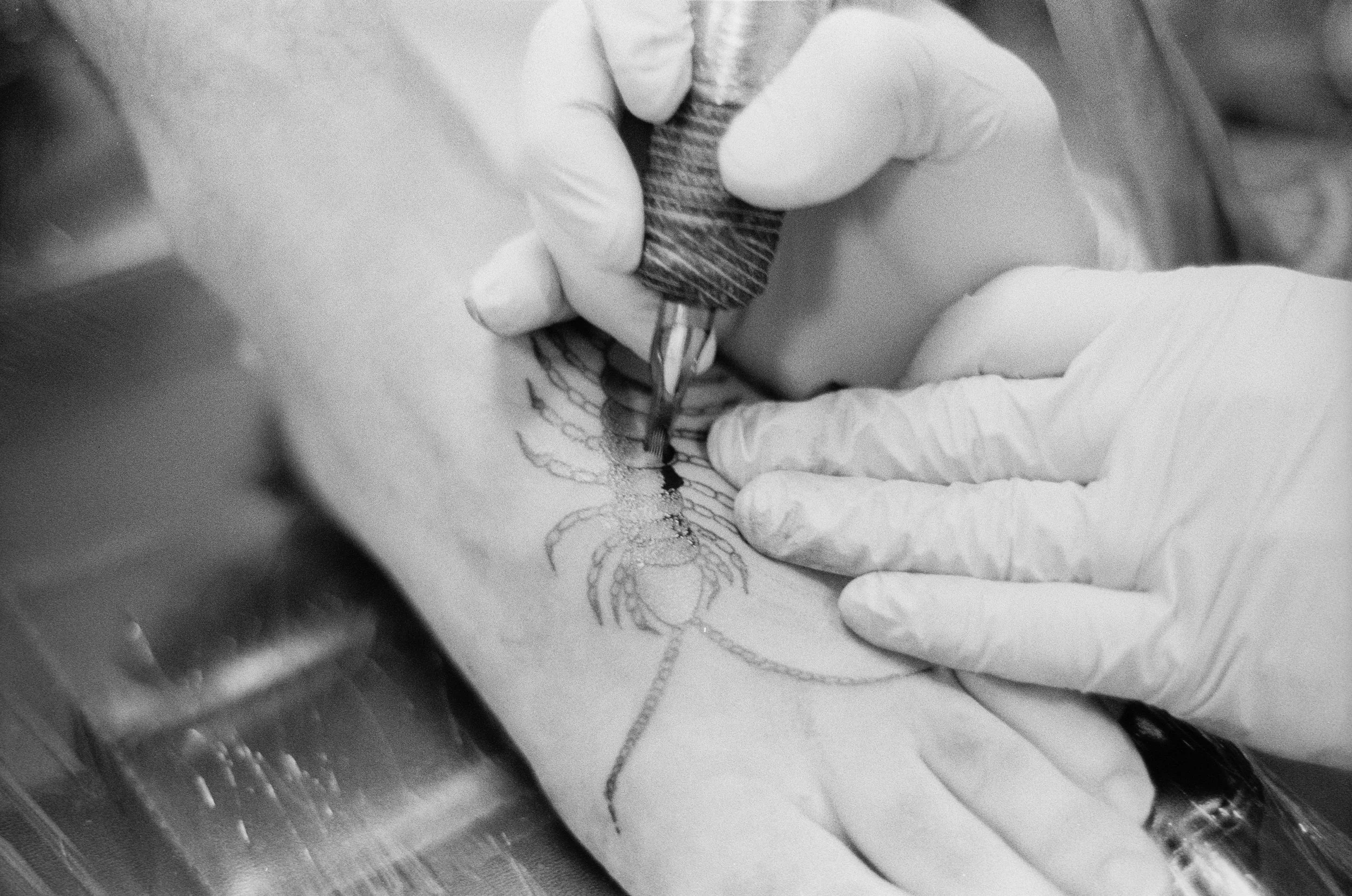
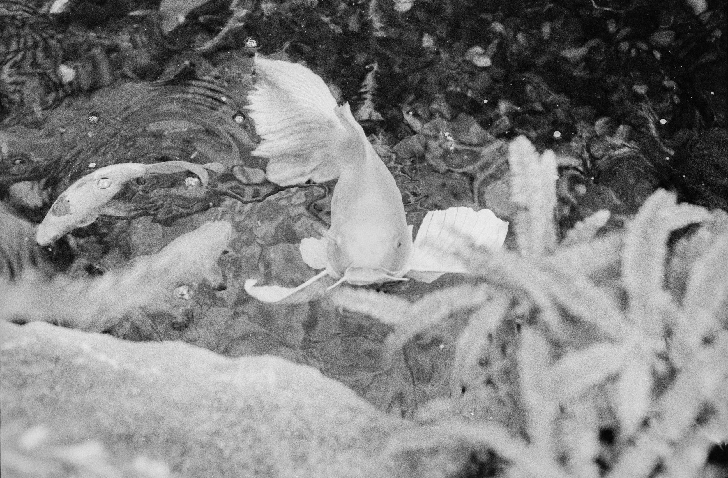
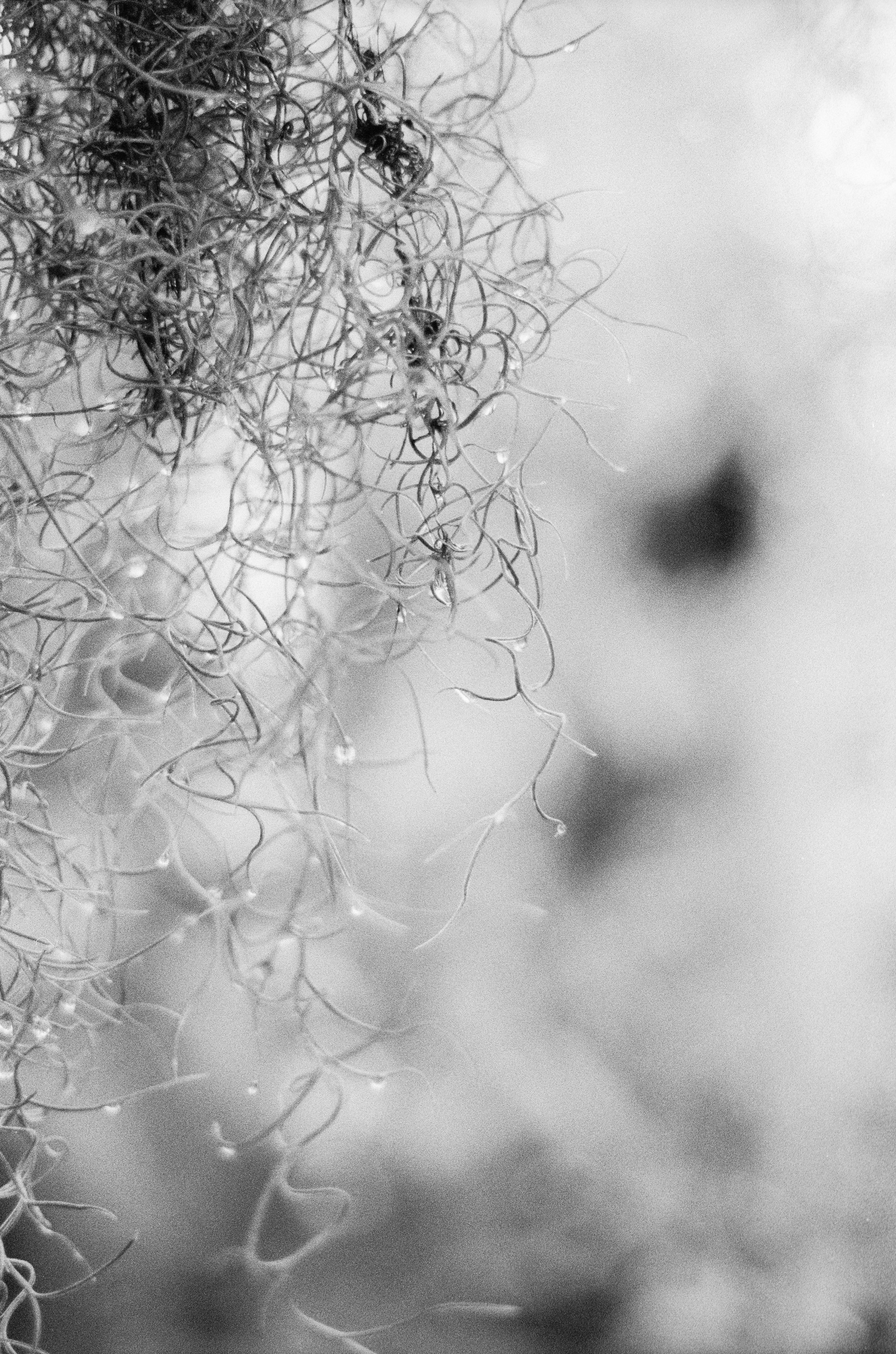
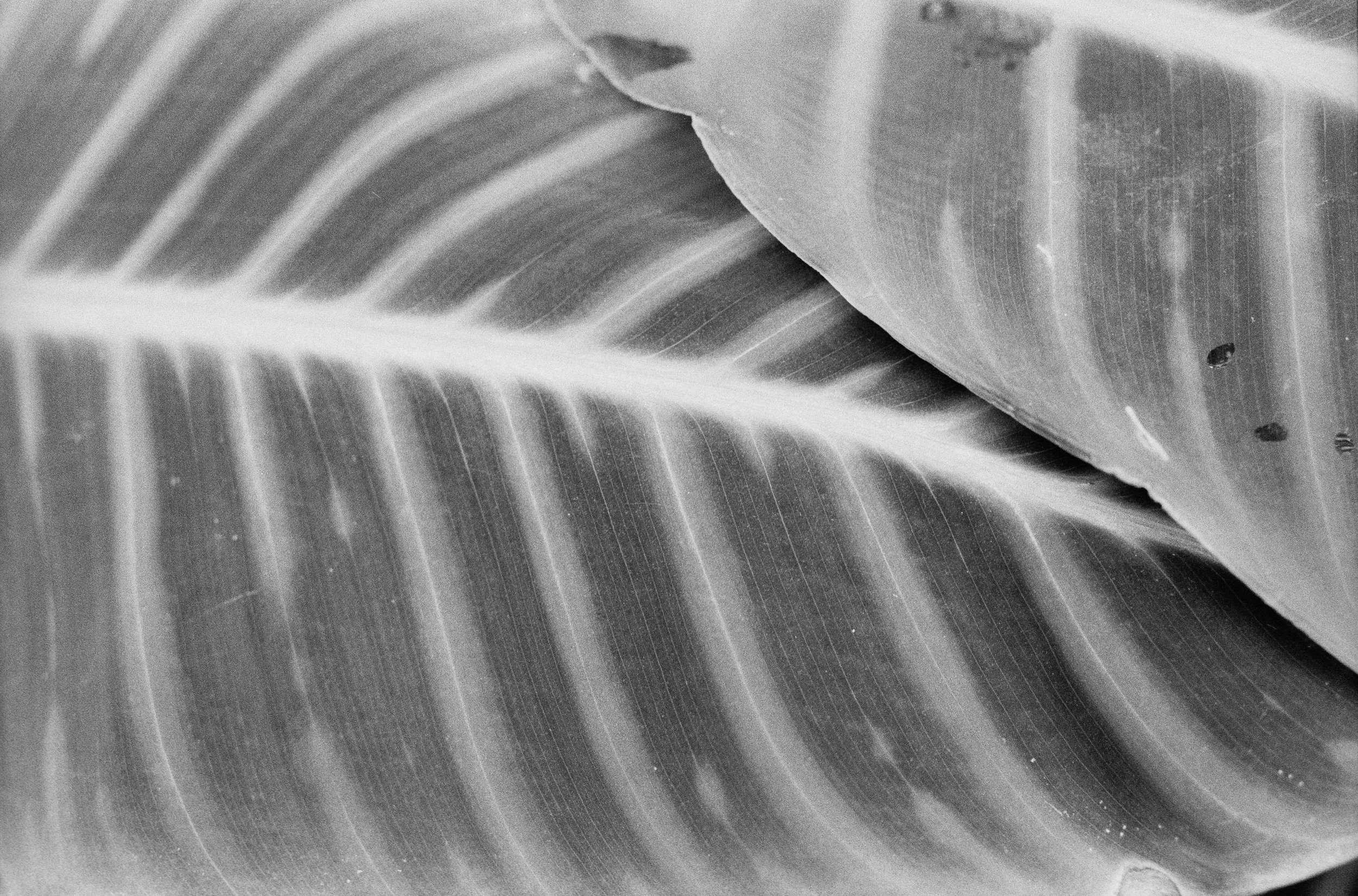
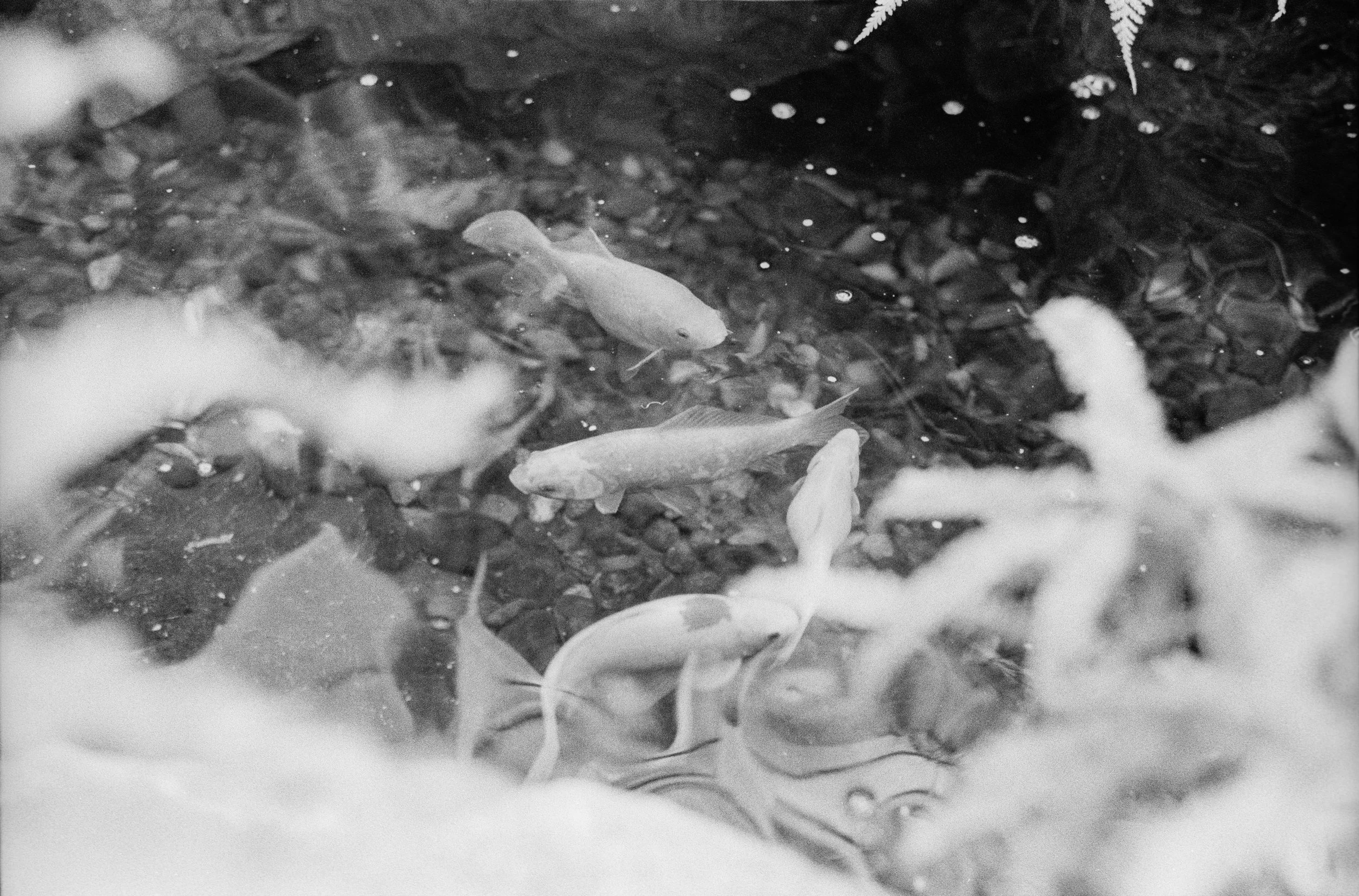
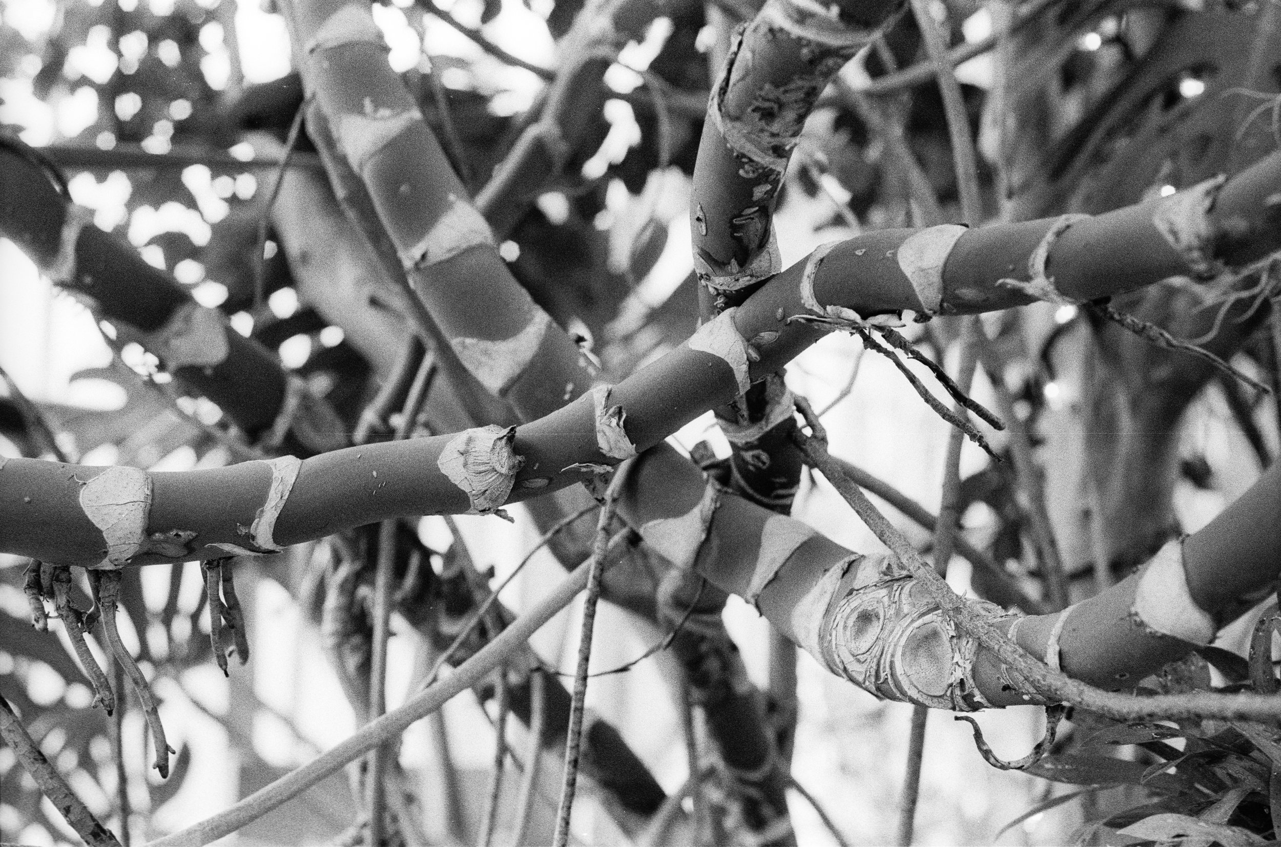
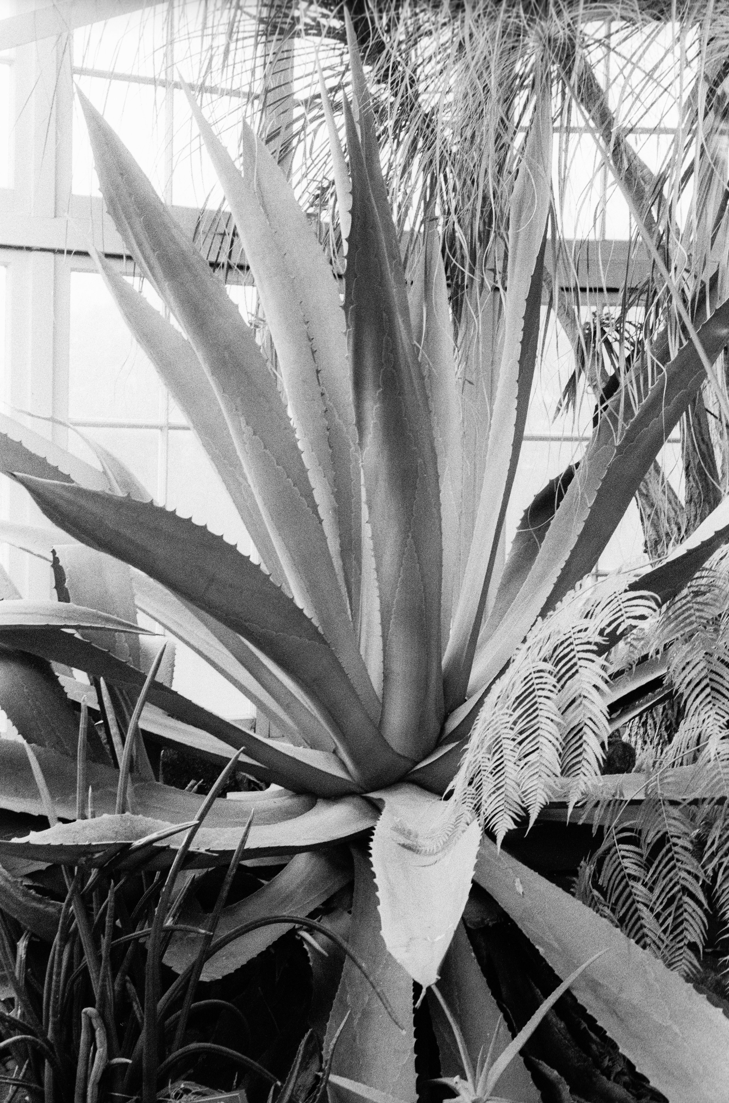
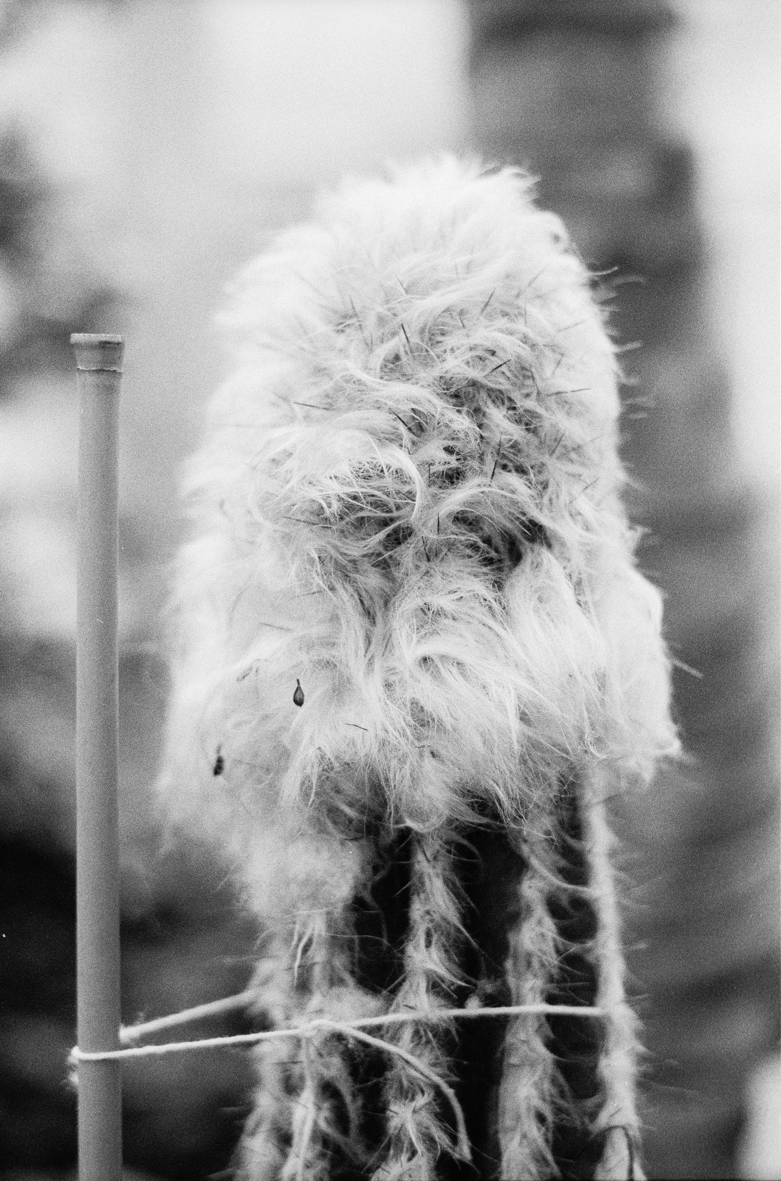
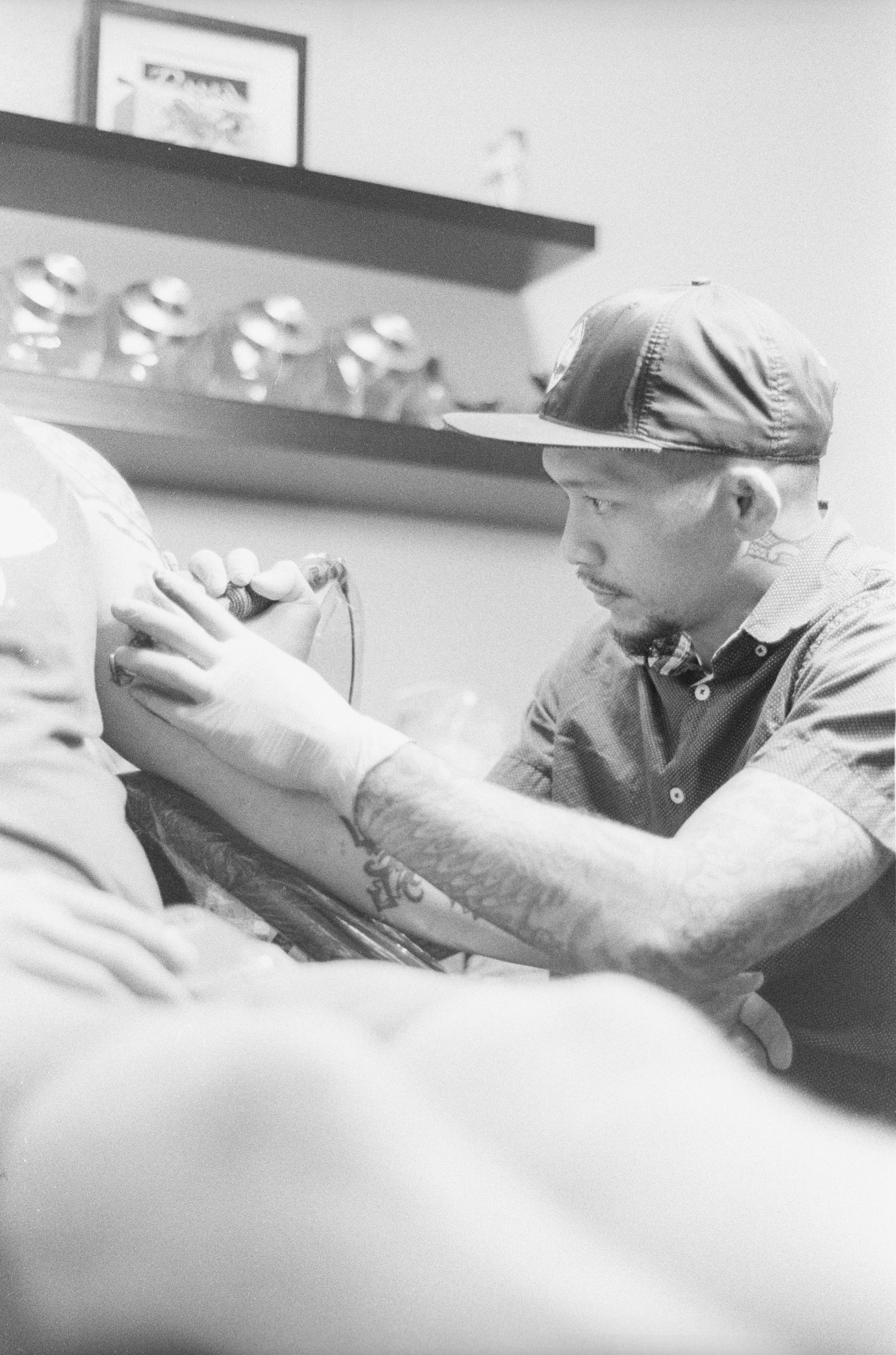
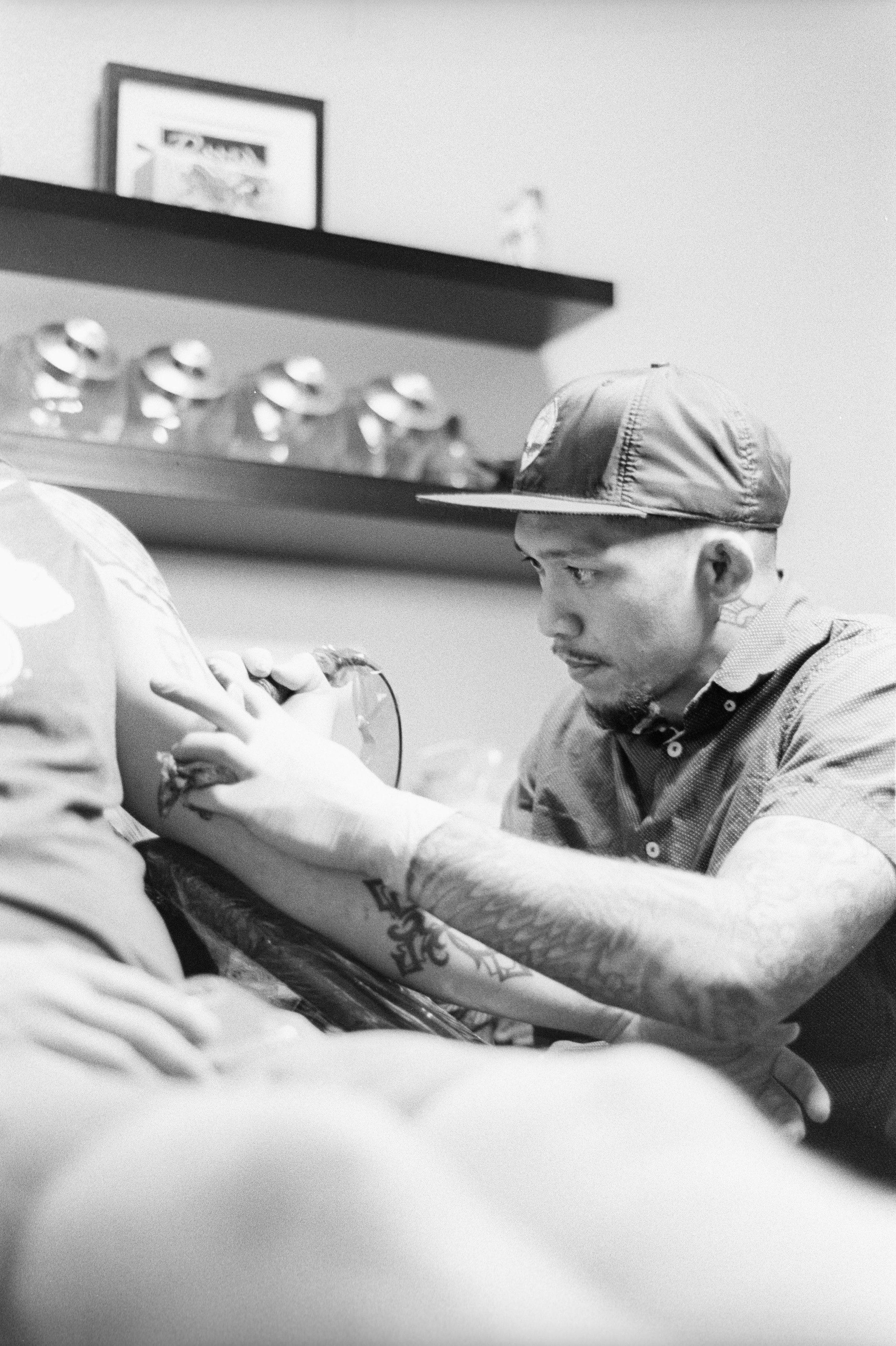
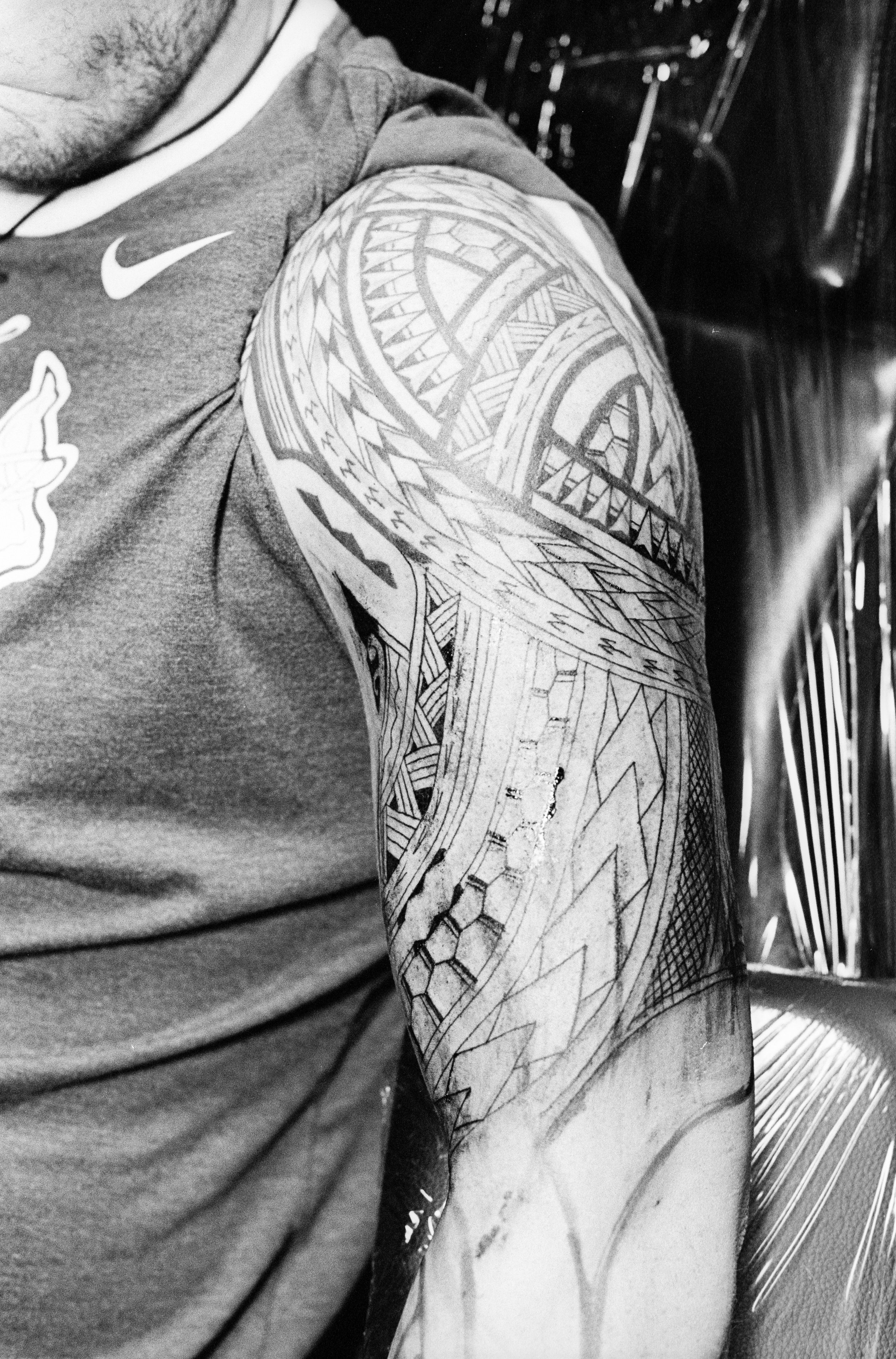
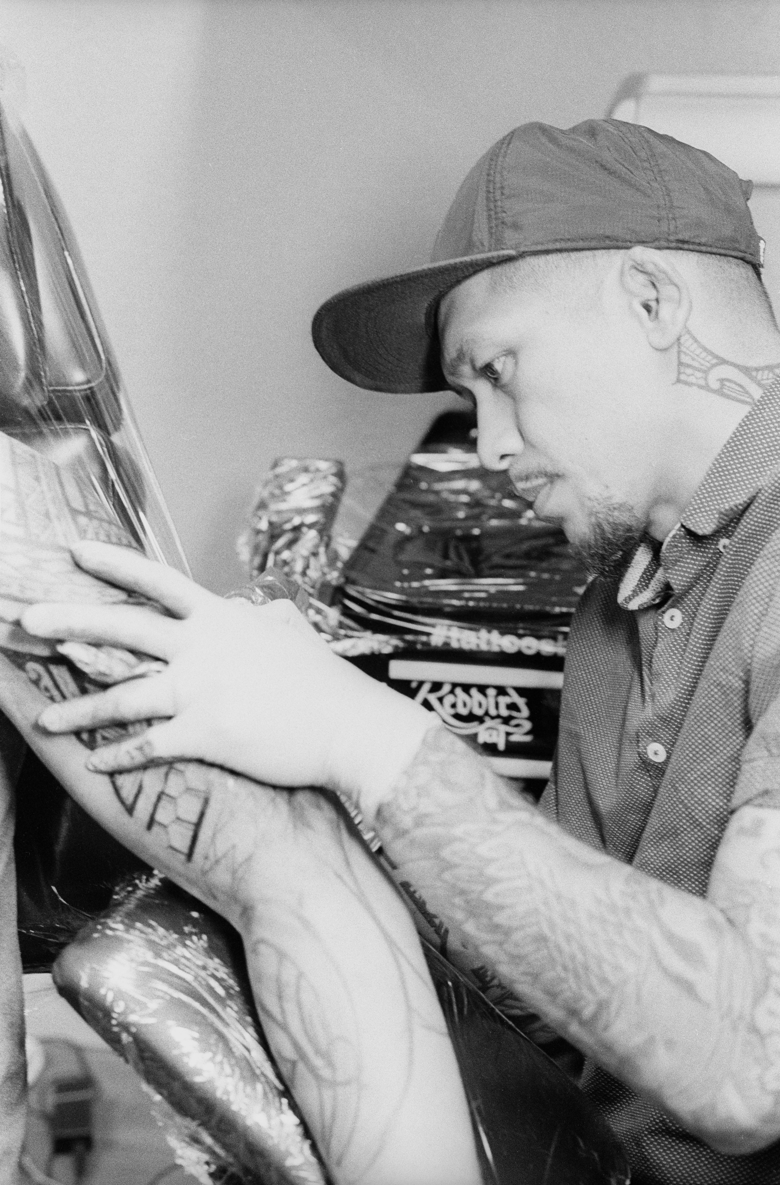
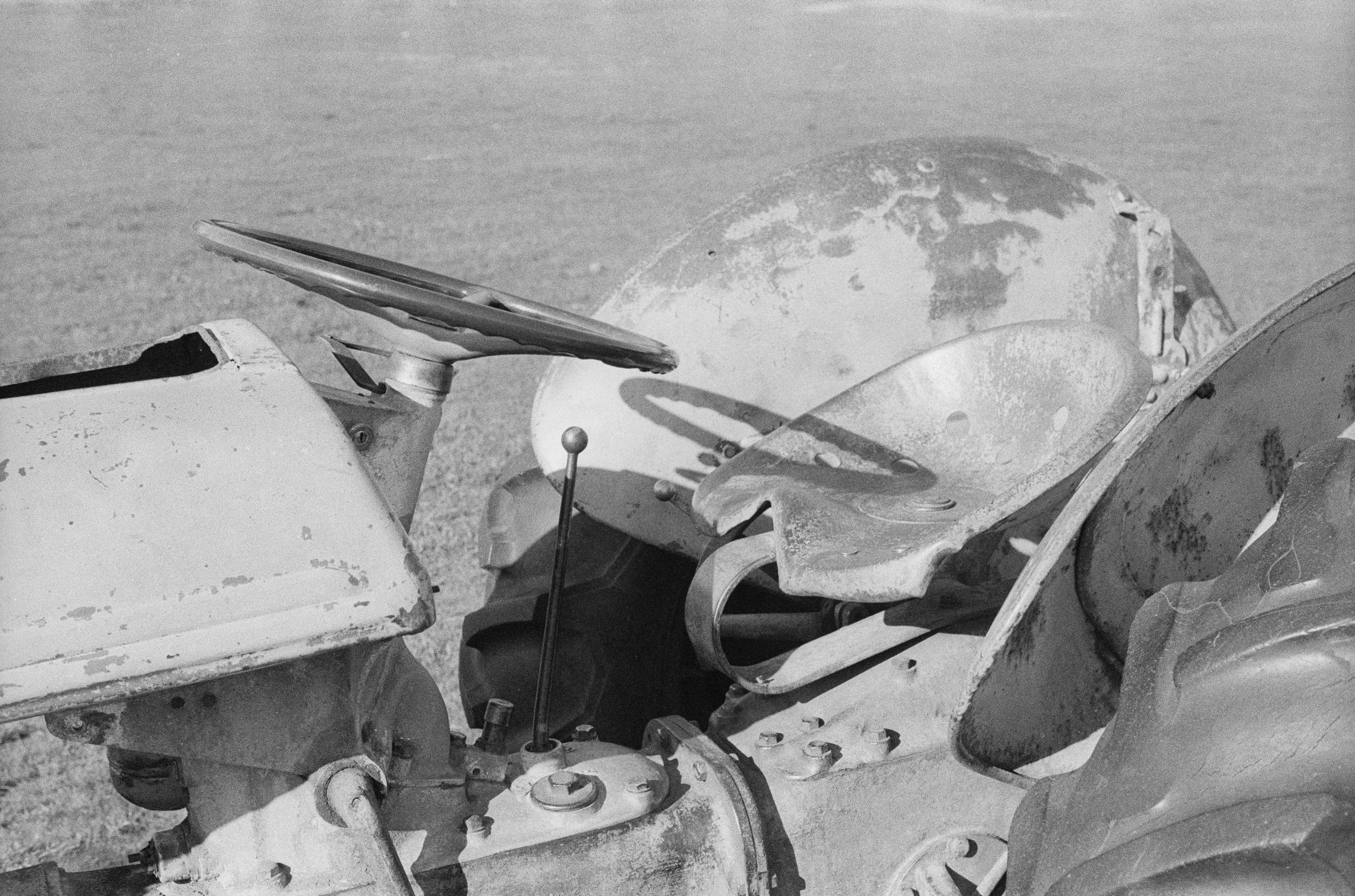
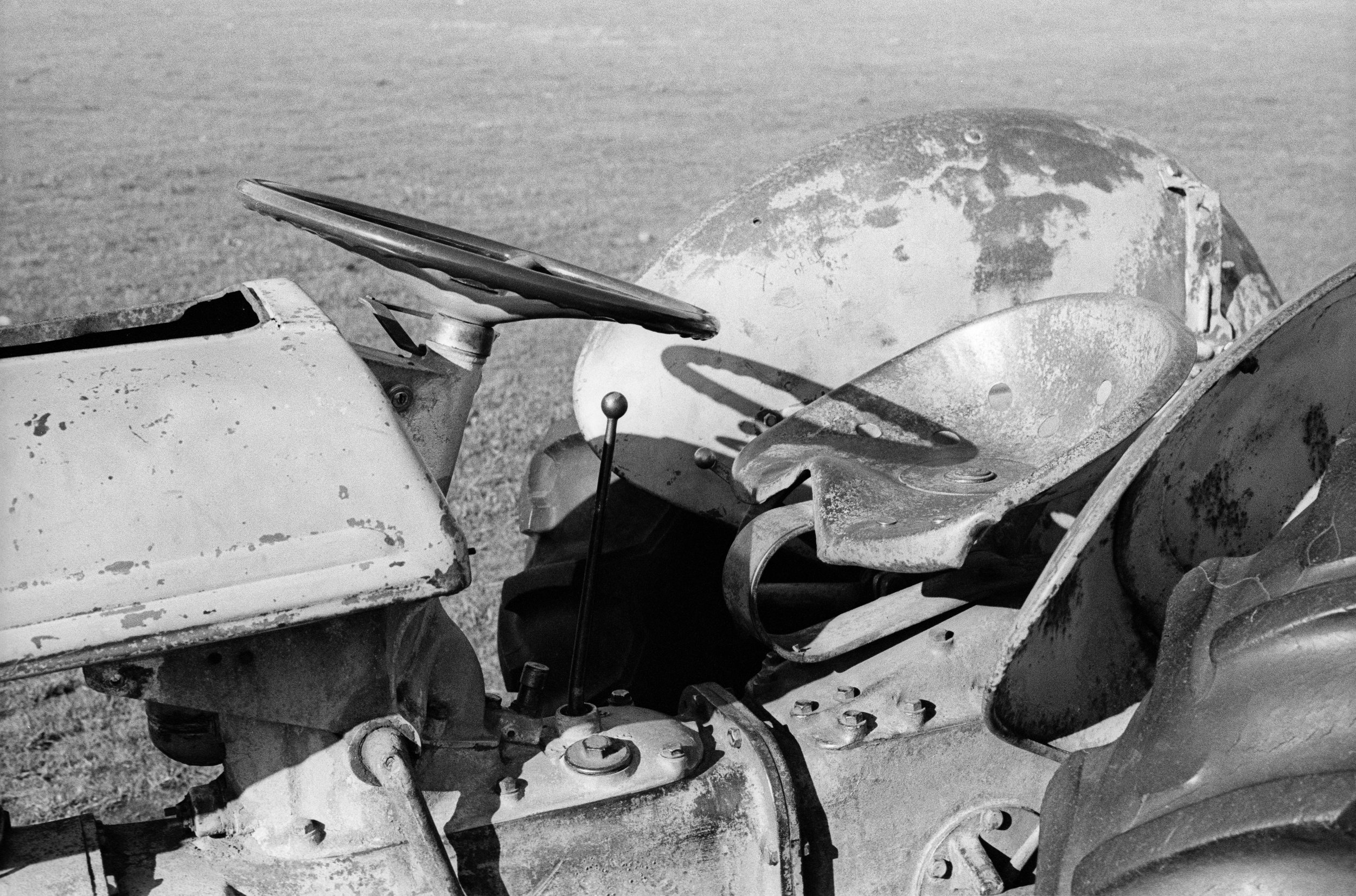
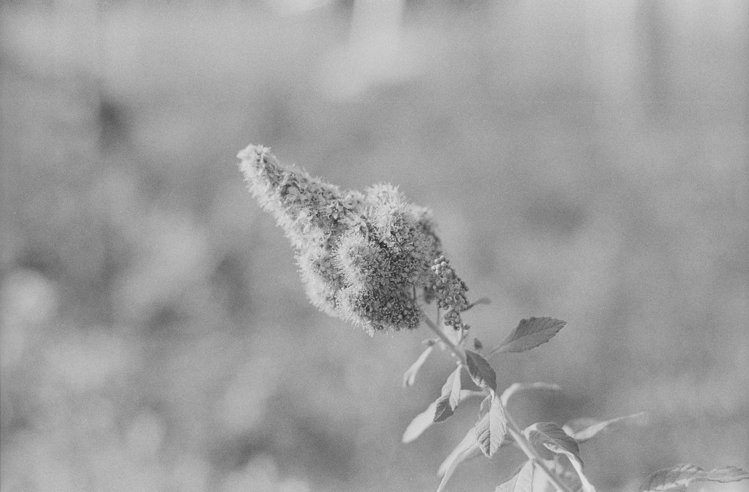
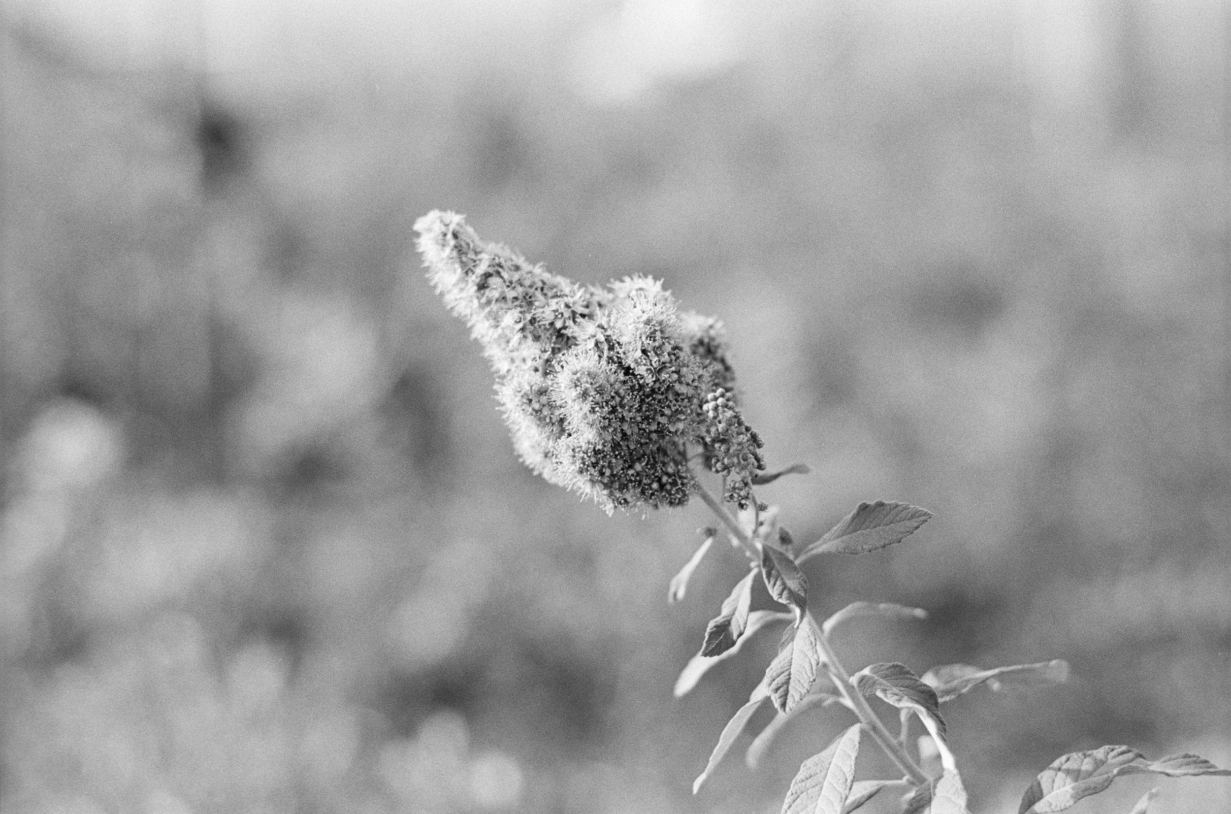
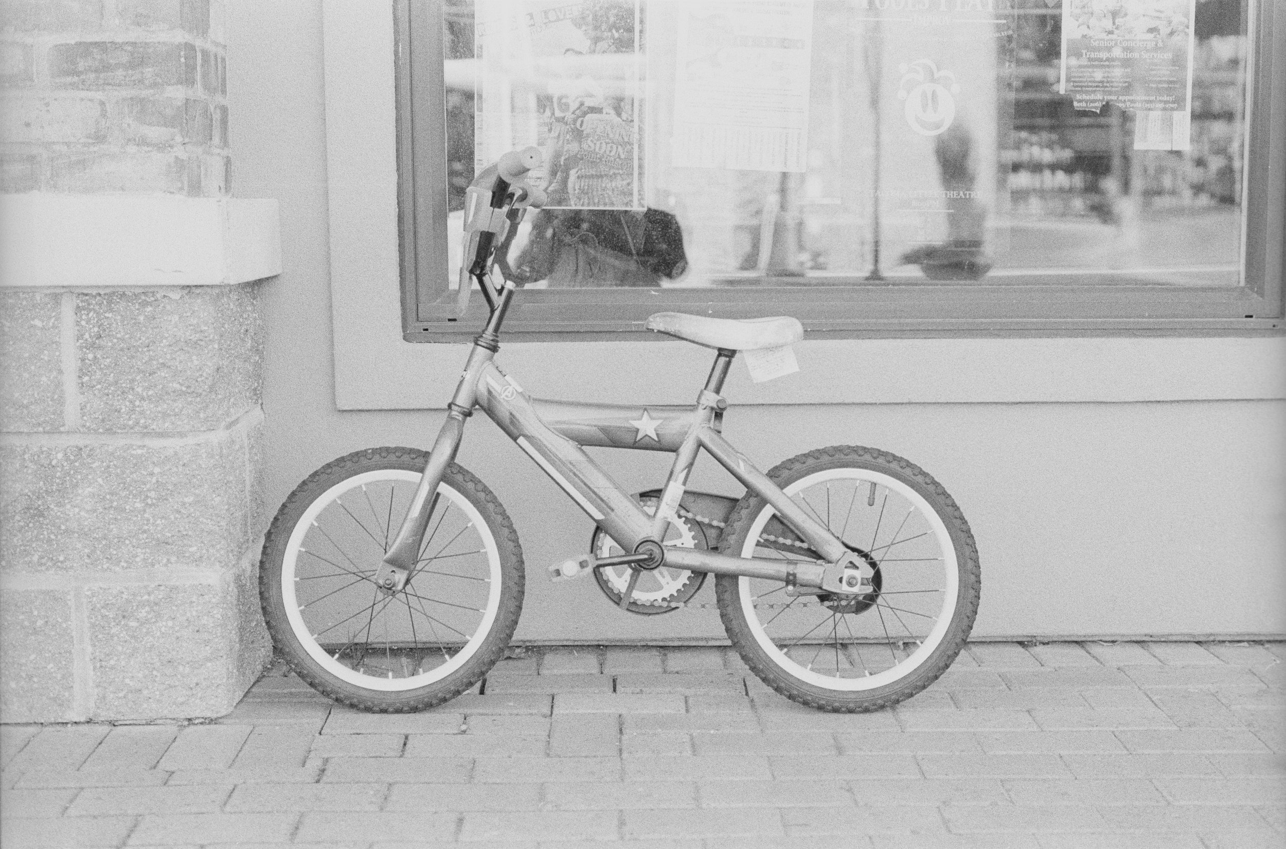
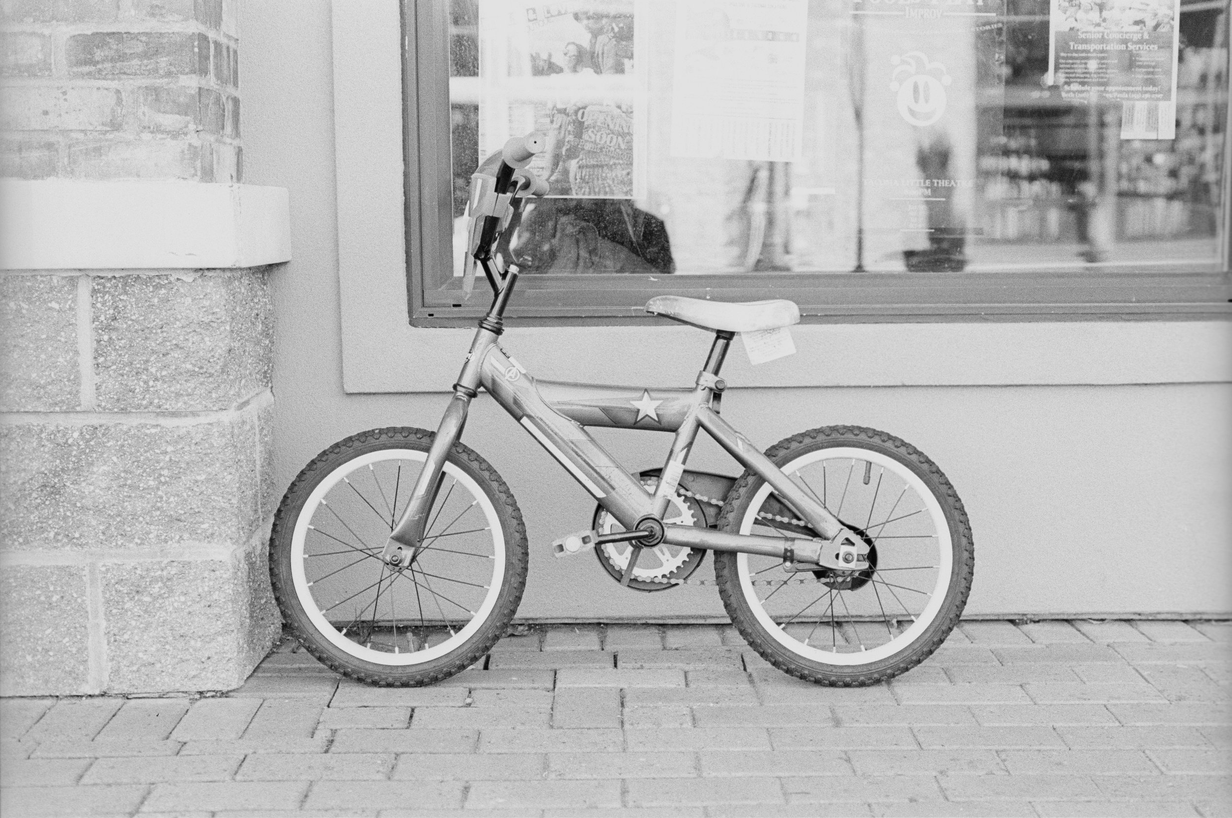
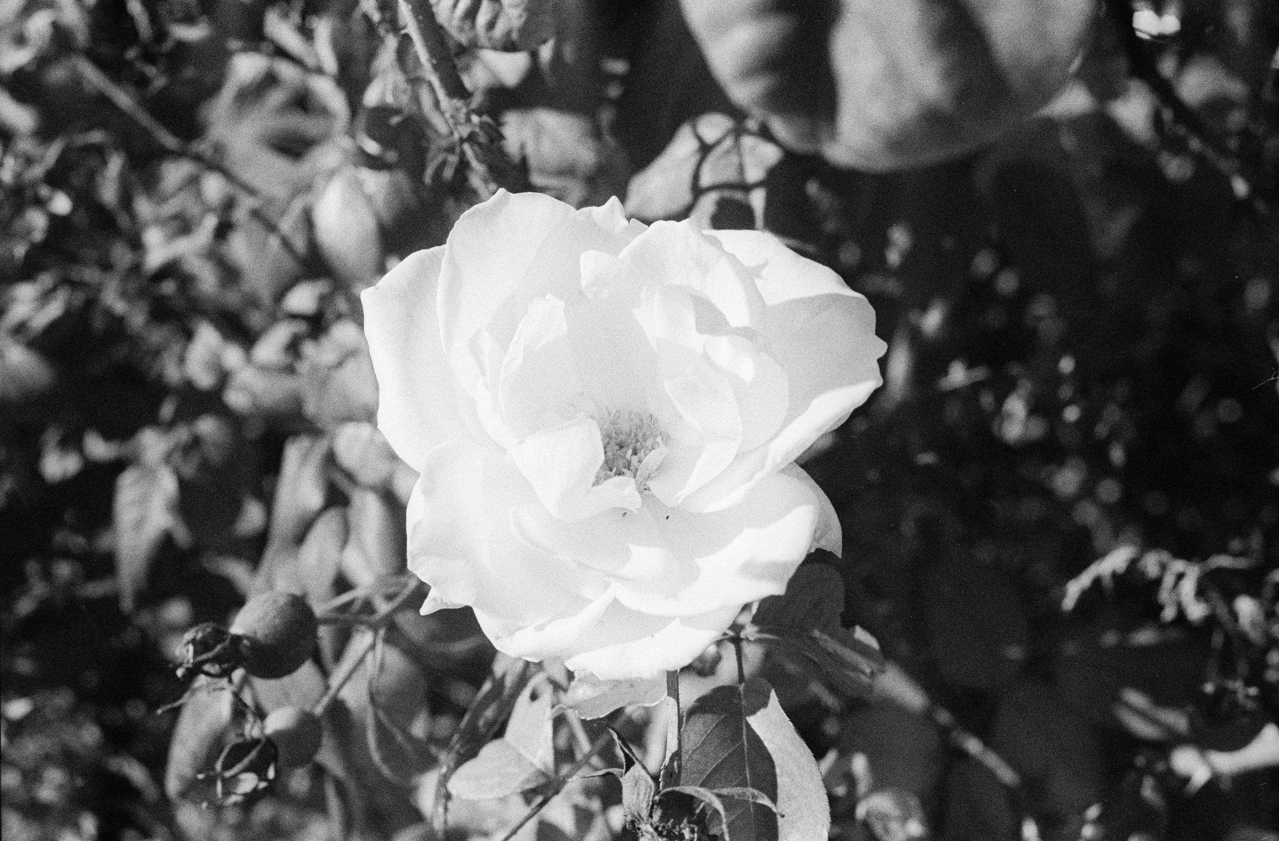
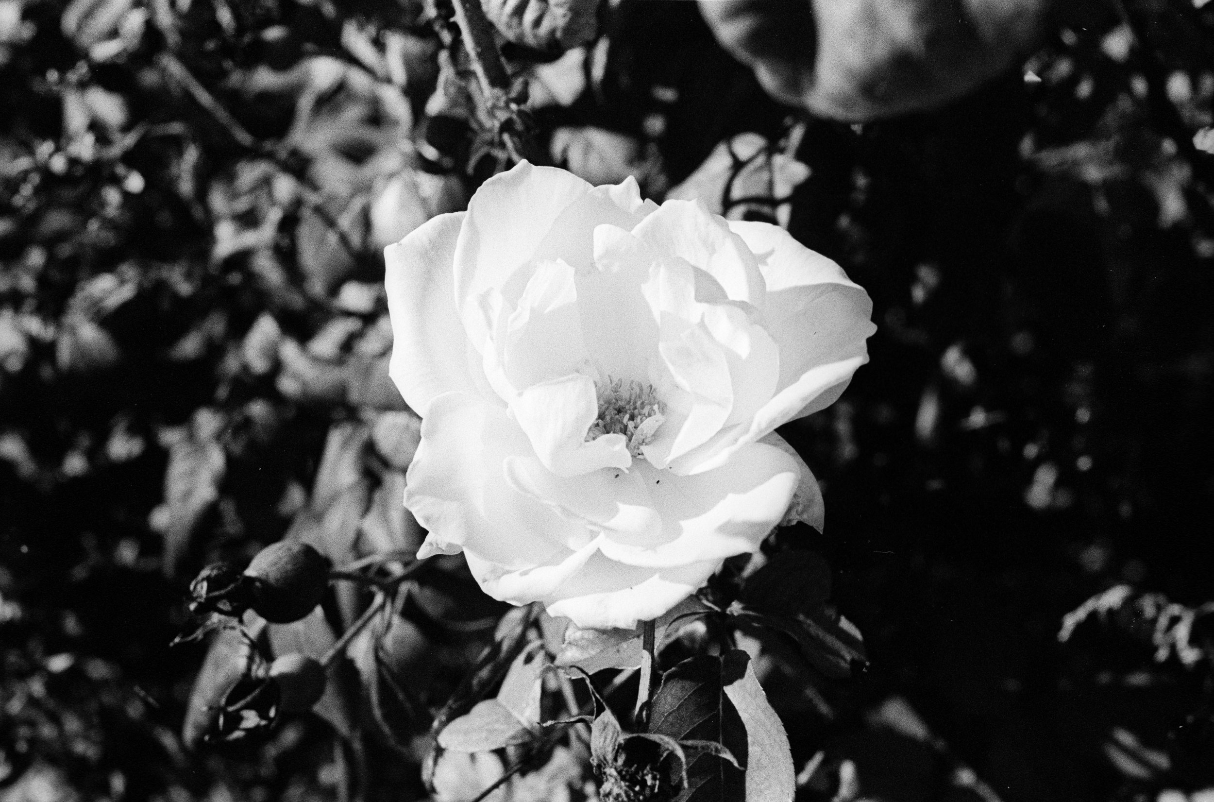
For this first image, let’s start with the grain. On my end the grain pattern between these two films are noticeably different. With Tri-X, the grain seems to be closer together, giving it the perception that it is finer. With HP5, I can see a lot more space in between the various textures of the grain. This makes it more noticeable and prevalent in my opinion.
In terms of sharpness, I’ll cover this later with pictures that I think show the differences better.
Contrast. I think between these two images, although the differences are minor, it is noticeable. Tri-X is a more contrasty film. Pretty anywhere that’s in shadow, in this image, the blacks are going to be darker. Looking that the face of the artist with HP5, it almost looks like there’s one shade of grey. While on Tri-x, there are clearly defined shades and tones. You can argue that this is because the artist moved and the face is lit differently but I don’t think anywhere near what these images show. Remember, he’s wearing a hat and realistically, under that bill there should be noticeable shadows. In this situation, I think Tri-X is more true to life.


